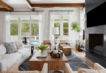
For color and pattern to work together, it’s important to keep two requirements in mind—balance and scale. “Everything can’t be patterned or brightly colored,” Sarah says. “The busier something gets, the less you actually notice any of it.” Here are Sarah’s tips to pull off the best balancing act:
Size matters. When incorporating prints and patterns, select some in all sizes. A large print works best with a small or medium print or even a stripe. Mix and match pattern types too. For example, pair geometric prints with floral patterns. “If the patterns are too similar in look, they will compete,” Sarah says.
Find the right tone. Just as with patterns, make sure colors aren’t too similar in tone. For example, if using blue and green, go with a darker blue and lighter green or a greyish blue and Kelly green. Or perhaps keep one tone cool and bring in a warmer tone. “If you do want to stay with just cool or warm tones, at last do varying shades of depths in your chosen colors,” says Sarah.


Stay negative. Let there be some negative space so the eye has a place to rest. For instance, choose solid velvet pillows on a patterned chair, or select a solid sofa if the room features patterned drapes and pillows. “After all, if everything is a showstopper, nothing is a showstopper,” Sarah says.
Start slow. If new to color or pattern, start bringing them into a space with items like lamps, pillows, and accessories. “Those are easy, more budget-friendly places to get your feet wet,” Sarah says. “Then you can build from there.”
Start small. “A small space is a great place to introduce a fun wallpaper because you get more bang for your buck,” says Sarah. “You can do a funky print since you’re not doing much of it.”
Resources:
Designer: Sarah Moore, Sarah Catherine Design
Sarah’s home décor shop for accessories: Sweet Home by SCD, [email protected]; IG: @sweethomebyscdNook


