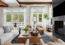
Warm, welcoming, and lived in—those were the criteria Sara Beth and Sam Wilcox had for updating the design of their 1954 rancher in the Hollywood section of Homewood. And because the abode is under 2,000 square feet, the couple also knew the must-have list needed to include maximizing every bit of space. “We both really liked the idea of having a smaller home, and we chose this house because it had really good bones,” says Sam. “But we needed to make it not only cozy for us but also functional for entertaining friends and family.”
The Wilcoxes sought out the design expertise of Fran Keenan to curate the interiors and make sure every room felt as comfortable as it was collected. Fran started with a crisp, clean white palette for the walls—a simple backdrop that would “hold hands with the textiles and art in each space,” she says. To play with the smaller scale of the rooms, the designer went big in unexpected areas such as the floor-to-ceiling gallery wall of heavily mixed-and-matched artwork and prints in the living room. “People often think that in a smaller space you need smaller things, but bringing in bigger items adds a lot of impact,” she says.


Details were key in finishing out each space, and Fran layered in lots of them with plenty of custom pillows, draperies with delicate trims, and a mixture of new and antique pieces. She incorporated more interest by intermingling feminine and masculine patterns and textures, such as the velvet and tweed pillows on the sofa. A geometric Turkish Oushak rug from Paige Albright Orientals enlivens a traditional seagrass rug, while a portière adds separation between the living and dining areas and offers another element of softness.
“Fran’s cozy interior design made it feel like we added on square footage. We couldn’t have asked for more,” says Sam. “We were able to have the smaller, comfortable home we wanted but one that’s also completely functional for both daily life and entertaining.”


Salon Style
Fran Keenan’s tips for creating the perfect salon-style gallery wall.
Play with Scale
A gallery wall is much more interesting when the scale is varied. Choose prints and paintings of all sizes and shapes, and be sure to spread out those shapes and sizes instead of grouping them together.
Mix the Mediums
For a collected feel, choose a variety of mediums, styles, and periods. Here, framed and unframed prints mix with oil paintings, lithographs, architectural drawings, and even antlers in a European mount.
Tell Your Story
Just starting your collection? Find pieces that speak to you or that carry personal significance. Artwork doesn’t have to be expensive to be interesting and meaningful.
Use Your Space
A traditional decorating rule says that you should always hang artwork at eye level. That’s fine for displaying an individual piece, but for a gallery wall, you’ll want to vary heights and hang pieces from floor to ceiling.
More is More
Whether you use paper templates to lay out your wall or just opt to freehand it, consider your display fluid. Spacing between art doesn’t have to be exact, which makes it easy to add and take away as you collect new pieces.

Outdoor Living
Landscape designer Peter Falkner demonstrates his philosophy that goes well beyond just creating beautiful gardens. “It’s also about giving the homeowners a reason to stay outside and enjoy the space,” he says. In this backyard, Peter designed a gracious courtyard with fireplace and dining courtyard. To define each space, he framed a brick wall with low-growing Korean boxwood hedges and used Selma brown pea gravel underfoot. Tree-formed hollies provide privacy without taking up much ground space. “Using big scrubs can overcrowd a small area as they grow,” he says. To soften the space—and make the white-painted fireplace pop—he covered the patio wall with creeping fig.


Around the House


