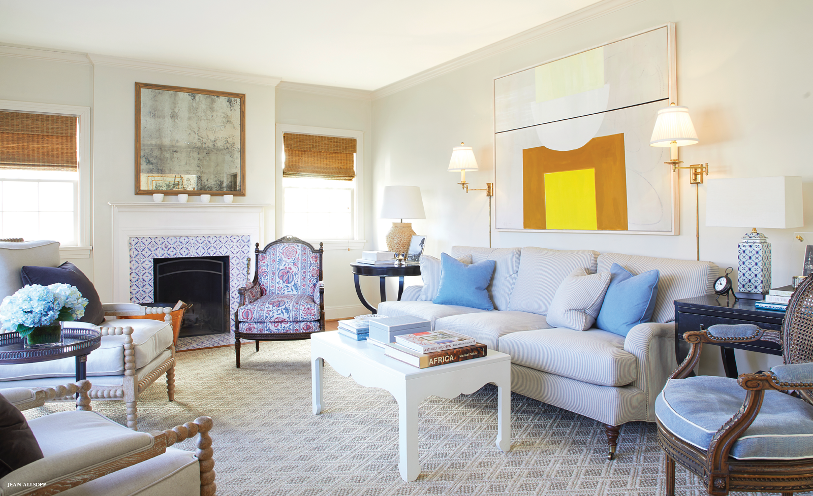
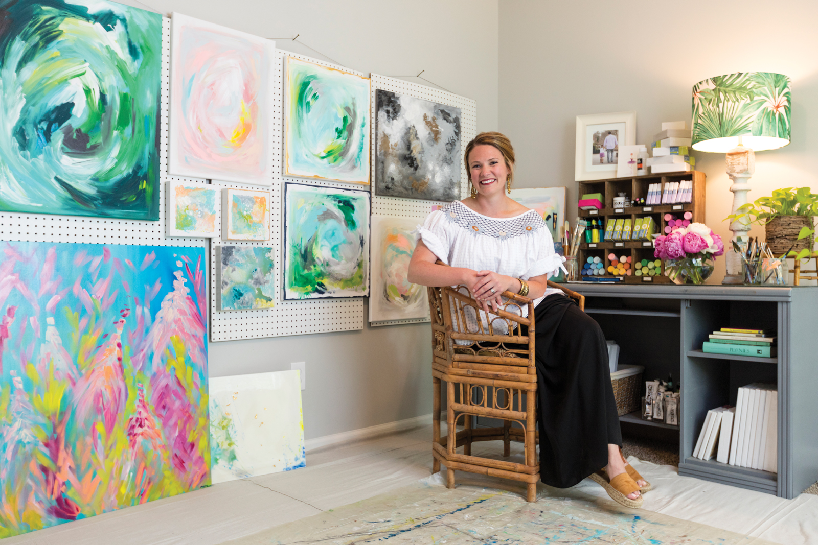
Step inside Ashley McCullars’ studio and you’re instantly greeted with the kind of smile she gives her first-grade students when they walk into her Edgewood Elementary classroom. It’s the sincerest form of welcome—the kind that makes you feel right at home. And she conveys the same sense of warmth in her artwork. We sat down with Ashley to discuss how she remains so vibrant in everything she does.
Your art is colorful and happy. How do you think your paintings reflect you?
There are many things I am not— organized, type A, tidy, ahead of schedule, etc. But I do think I am a pretty happy person. I feel I’ve done my job as an artist if a piece of my work brings happiness into a home. I am also driven by the idea that it doesn’t have to be perfect to be beautiful. I’m certainly not perfect, and I find joy knowing I don’t have to be.
What inspires you?
Color. I love color! I do appreciate clean, crisp white, but I crave pops of color, and that is reflected in my work. I embrace the belief that beauty is in the eye of the beholder, so I try to offer a variety of color palettes, styles, and sizes so that everyone might find something they love and can picture in their home.
How do you approach each painting?
I begin with a color palette in mind, but I almost never have the end product envisioned until the work is complete. I like to turn on music and let the art take shape as I work. I paint until I’m happy with the piece. Some pieces evolve quickly and effortlessly while others are a labor of love and take more time. My husband often plays a role in the process as well. He’s my biggest supporter, but I also think he’s my toughest critic. He’s artistic and has a good eye, so I appreciate his feedback.
What is your medium/style?
I love painting abstracts with acrylics. Acrylics offer a vast color selection, the ability to layer and texture, easy cleanup, and a fast drying time—which is a huge benefit since my children are constantly around my artwork. I enjoy working with watercolors too. They’re beautiful and soothing. I prefer realism when I paint with watercolors—anything from fruit to ballerinas to sketches of houses.
Can I afford you?
My goal is to provide affordable artwork. And since I am new to the art scene, my prices reflect that. I also take commissions and am always flattered when someone asks.
Find Ashley’s art at…
Four Seasons Gallery in Homewood and sometimes at Pepper Place Market. Follow her IG at ashleymccullarsart for pop-up shows, or contact her at [email protected]. Headed to the beach? Look for Ashley’s artwork at East End Gallery on 30A.
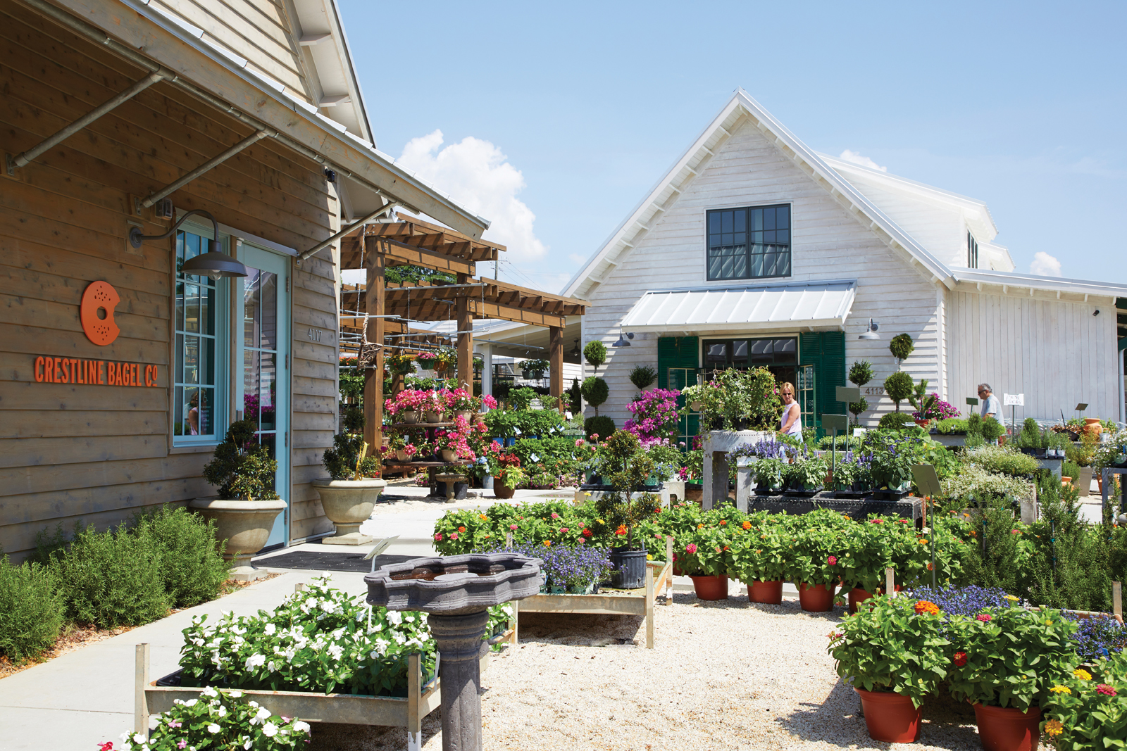
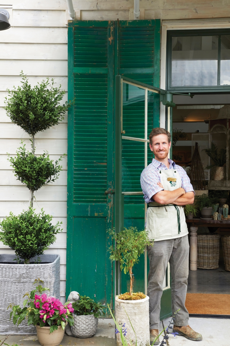
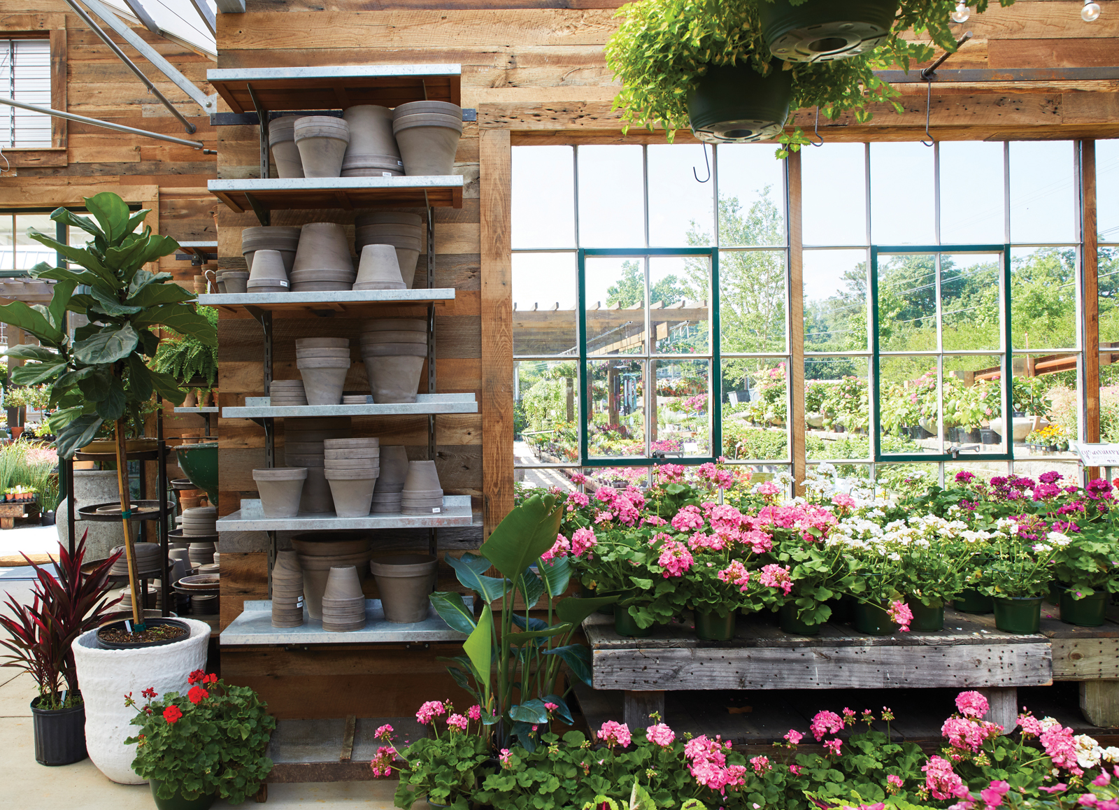
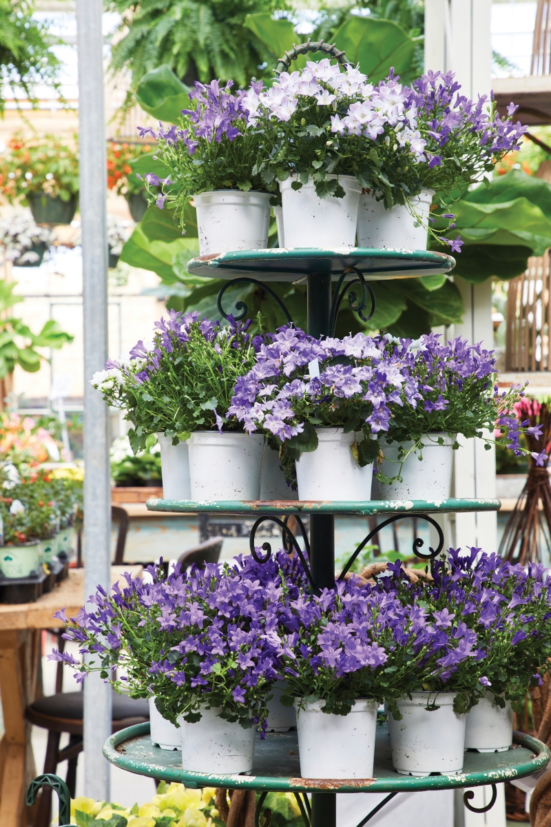
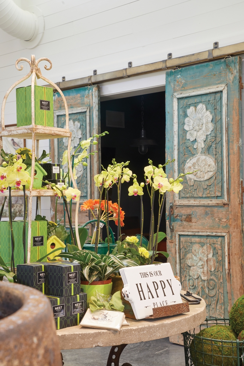
Topiaries. Check. Flowering baskets. Check. Herbs. Check. Fiddle-leaf figs. Check. Leaf & Petal offers everything green imaginable, as well as the dirt and oh-so-chic pots to go with it. Flourishing under the thumbs of the Pursell family (they are known for their fertilizer business, after all), the brand has blossomed. In 2007, Lydia Pursell opened its second location with Leaf & Petal at The (Botanical) Gardens, introducing gift items, antiques, found objects, lamps, accent furniture, and jewelry. The latest endeavor, spearheaded by owner Jamie Pursell, is the most ambitious of all. “Our ideas are limitless, and our dreams are big, ” touts the company’s website—something Jamie has put into action while maintaining a service-first approach to making each customer feel like the only person in the store. Jamie shares the scoop on Leaf & Petal’s newest location near The Summit.
What was your vision for the new space?
In the summer of 2013, my wife and I took a “babymoon” to London while she was 7 months pregnant with our first child. I always love to visit garden centers for inspiration when I travel, and we researched a few to check out during that trip. The experience we had eating and sipping tea in the greenhouse at Petersham Nurseries was the inspirational seed for the entire development. The ambiance of a garden center with its visual beauty and soothing sounds is the perfect backdrop for a dining experience. And customers love grabbing a coffee, tea, or sweet treat during a garden shop visit. We saw firsthand that it worked in London, and now we know it works here too. We wanted to create the ideal place to have an informal business meeting or catch up with an old friend. We have Crestline Bagel on one side of the shop, offering breakfast, lunch, and great coffee, espresso, and tea. On the other side, one of Birmingham’s top restauranteurs, Becky Satterfield, is doing a new latin-themed concept called El ZunZun.
Who do you credit for the design?
There are so many people and influences that had a hand in creating the store. The Pigfords and their team at ArchitectureWorks did an amazing job, and the final result exceeded my expectations. My dad’s wife, Lydia Pursell, made multiple trips to New York, High Point, and Atlanta to pick out the antique fixtures and found objects that make the space come to life. Our stylist team, led by Carl Hatchett and Jane Yearwood, spent weeks designing the layout and beautifully arranging it with product. It was definitely a team effort.
You have lots of lovely architectural pieces (doors, tables, etc.). How do these reflect your overall design purpose?
Since Leaf & Petal has been around for more than 40 years and has a lot of history and patina, I consciously wanted to avoid building a structure that felt too new. I wanted the facility to have depth and character and to speak to a time many decades prior when materials were solid and of high quality. Some of the architectural elements in the building harken back to the 1920’s, and there also are touches of brass, bronze, zinc, and reclaimed rough-sawn red oak throughout. For example, the bathrooms have a black-and-white hexagon penny-tile pattern on the floors, and the antique half-light doors have original brass “vacant/engaged” door locks that date to 1927. My biggest elective expense included all the old-fashioned steel doors and windows on the buildings. The Bessemer Glass Company still fabricates in true divided light and putty glaze, and their quality of work is on par with any fabricator in the country. We used single-paned glass in all of the doors and windows to give a crisp, clear view of the outside from the inside (and vice versa) that cannot be attained using the modern insulated glass that is the standard in building now. The dominant paint colors are a warm, soothing white and a classic British green.
It’s lovely for sure, but it’s also full of hardworking goods and great service. How do you accomplish this balance?
Lots of people! It takes about 50 percent more staff to run this new store than the old Summit location did. The store literally changes every single day, so it takes a small army to constantly restock, clean, and keep the merchandise looking its best. During busy seasons, we receive 40 to 50 deliveries every week. This new store is also being offered as an event space. We’ve had seated dinners with 60+ guests and have some booked for well over 100. We’ve let church small groups use the greenhouse as a meeting space during business hours, and we even have an evening yoga class meeting here on Tuesday nights.
Leaf & Petal at The Summit • 4113 Crosshaven Drr. 205.967-3232 / Leaf & Petal (Mountain Brook Village) • 2322, 2817 Cahaba Rd. 205.871.3832 / Leaf & Petal at The Gardens (Birmingham Botanical Gardens) • 2612 Lane Park Rd. 205.877.3030 leafnpetal.com
1/2 of a medium seedless watermelon
1 red onion, cut in half vertically and thinly sliced
2 cups pear-shaped yellow tomatoes, cut in half
1/2 cup olive oil
1/4 cup red wine vinegar
3 tablespoons chopped fresh mint
3 tablespoons chopped fresh basil
Salt and pepper to taste
1 (4-ounce) package block feta cheese
Fresh mint or basil leaves for garnish
Cube watermelon into bite-size pieces, and place in a large bowl; add onion and tomato halves. Whisk together oil and vinegar until blended; stir in mint and basil. Drizzle over watermelon; toss gently. Add salt and pepper to taste. Top with feta cheese, and serve immediately. Garnish with fresh mint or basil leaves. Serves 8 – 10.
Learn from Leslie: To make a watermelon bowl, carefully cut the top third of the watermelon off horizontally, and then remove watermelon in 1-inch sections or rows. When all is removed, neaten up the edges with a paring knife, and scoop out excess juices with a large spoon.
2. Baked Corn and Jalapeño Dip
4 ears corn, kernels removed
4 ounces light cream cheese, softened
1 1/2 cups sharp Cheddar cheese, grated, divided
1 (4-ounce) can mild green chiles, drained
1/2 small Vidalia or sweet onion, finely chopped
3 to 4 jalapeños, seeded and chopped, reserving a few slices for garnish
2 tablespoons mayonnaise
4 slices cooked bacon, crumbled
Jalapeño slices for garnish
Corn chips
Preheat oven to 350°. Combine first 7 ingredients in a medium bowl, reserving ½ cup of the Cheddar cheese. Place corn mixture into a lightly greased, 1½-quart ovenproof dish. Bake for 20 minutes; top with remaining cheese and bacon, and bake 10 more minutes or until hot and bubbly. Garnish with jalapeño slices. Serve with corn chips (Leslie likes Frito Scoops). Serves 8 – 10.
3. Scallopini Chicken Fingers
2 pounds chicken tenders (about 10)
2 cups panko (Japanese breadcrumbs)
1 cup Parmesan cheese
1 teaspoon black pepper
3 eggs, lightly beaten
3 tablespoons olive oil
3 tablespoons butter
Lemon slices and fresh herbs for garnish
Place chicken tenders between two sheets of wax paper. Using a meat pounder or rolling pin, pound chicken tenders to ¼- to ½-inch thickness. Combine next 3 ingredients in a shallow dish; set aside. In a separate dish, stir together eggs; add 1 tablespoon water. In a large nonstick skillet, heat half of the oil and butter on medium-high heat. Dip each tender into egg mixture and then panko. Place into hot skillet, cooking half at a time so as not to crowd the skillet. Use remaining butter and oil for the second batch. Keep cooked tenders warm on a cooling rack resting on a baking sheet in a 250° oven while cooking the remaining chicken. Serve warm on a platter. Garnish with lemon slices and fresh herbs. Serves 6 – 8.
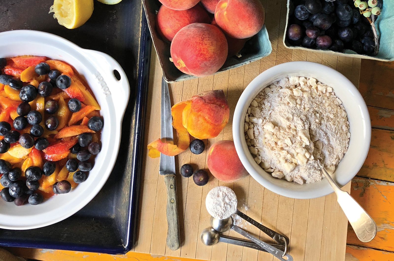
4. The Ultimate Cobbler Topping
3 cups all-purpose flour
1¼ cups granulated sugar
1 cup old-fashioned rolled oats
1 cup light brown sugar
1 cup slivered almonds, crushed
2 teaspoons kosher salt
1 teaspoon ground cinnamon
1 pound unsalted butter (4 sticks)
Combine all ingredients except butter in a medium bowl. Cut butter into small pieces and add to mixture. With the tines of a fork or a pastry blender, incorporate the butter evenly into the mixture. Using your fingers, make pea-size clumps. Divide into 4 Ziplock bags, and store in freezer until ready to use. Enough for 4 (9-inch) cobblers.
Learn from Leslie: For the 6-inch blueberry cobbler in the photo right, use:
1 pint of blueberries
1/2 cup sugar
1 teaspoon lemon zest
juice from 1/2 of a lemon
1 tablespoon flour in the berry mixture
Top with 1 cup of The Ultimate Cobbler Topping. Bake at 350° for 30 to 35 minutes until hot and bubbly and golden brown. Note: This topping works with all fruits and berries. Cooking times may vary depending on size of fruit and baking pan.
Jana and Carey Rome faced a fairly common quandary—a growing family of five in a finite space they had inhabited for more than a decade. The simplest solution would have been relocation, but that’s when they realized their dilemma—Jana couldn’t fathom leaving the Brookwood Forest area of Mountain Brook. “It’s a very easy place to live, and the topper was that we fell in love with the girls’ elementary school, ” she says. After looking at houses within their desired radius, the couple felt they’d exhausted their options. “We never found anything doable, ” Jana says. “We were weary with looking, and one day we just decided it would be better to add on to our current home. Once we thought of it as the house we were staying in for a long time, we felt more confident.”
The Rome sisters take a break from their busy summer schedules in the family’s backyard.
Photo by Laurey Glenn
Shea Bryars, one of Jana’s best friends, was a shoo-in for interior designer. Shea, who specializes in kitchen planning, also had longstanding relationships with the Romes’ architect and builder, creating a cohesive team for making decisions. “She knows how we live, and we’re such good friends, ” Jana says. “It was easy for her to say, ‘You don’t need to do that, ’ and she served as a great mediator between myself and my husband. If I wanted to do one thing and he wanted to do something else, we trusted that Shea would know what was best.”
It wasn’t always easy, though. As the former living room became an expansive kitchen, Carey had to overcome his initial resistance to the idea of seeing the kitchen from the front door. “He wrestled with that a lot, ” Shea says. “Today’s lifestyle demands the kitchen be the center of the home.” That’s particularly true for Jana, who loves to cook and had strong feelings against a galley kitchen.
To add visual impact to the open space, Jana discovered outside-the-box lanterns at Pottery Barn. “They aren’t traditionally what you see in a kitchen, but I fell in love with them, ” she says. Smoky blue cabinets pop against a white glass-tile backsplash, while a custom-designed sheetrock hood adds a rustic touch. “I love color, and Shea knew I wanted to incorporate plenty of it, ” Jana says. “Sometimes people worry they’ll tire of color. But an easy way to bring it in is with pillows or rugs or artwork—things that aren’t so permanent.”
Adding an upstairs floor meant only a small change in the footprint of the house, but it allowed for a separate bedroom for each girl. “My desire was to create the smallest house that would give us room for everything we need, ” Jana says. “I wanted just enough space what we would use every square inch of it on a daily basis.”
When it came time to decorate the girls’ rooms, Shea made sure to get their input. Since she knows the family well, she was familiar with the individual tastes of Olivia, 13, a fan of purple; Hillary, 12, who loves blue; and Kate, 10, who, like her mom, enjoys pops of pink. Varying shades of turquoise unify the rooms, which otherwise make distinctive statements.
With the renovation finished and the family settled in, Jana says her wish list is complete. “I don’t think we could have done a better job of making this home work for our family, ” she says.
Photos by Laurey Glenn
Why It Works
PRACTICAL MAKES PERFECT A renovation is an opportunity to breathe new life into pieces you’ve had for years. “One of the fun things was making our furniture seem new again in the different space, ” says Jana.
SHORT-TERM COMMITMENT Choose less costly fabrics that allow you to change bedroom decor as the kids’ tastes change. Look for fun art and accessories at places like HomeGoods and Hobby Lobby. “That way, it won’t break your heart—and your bank account—in five years when kids want to change it up, ” Shea says.
KNOW YOUR OWN MIND Carey was adamant about including a sizable screened porch for his take on a man cave, although Shea was concerned the expanse might overwhelm the exterior profile. Thanks to smart design, the room ended up blending beautifully, and the space is something the entire family now enjoys year-round.
ABOVE Shea emphasized the importance of light, one of the costlier aspects of interior design: “Windows are a big investment, but they’re so important, ” she says. “The light is so great for our psyche.”
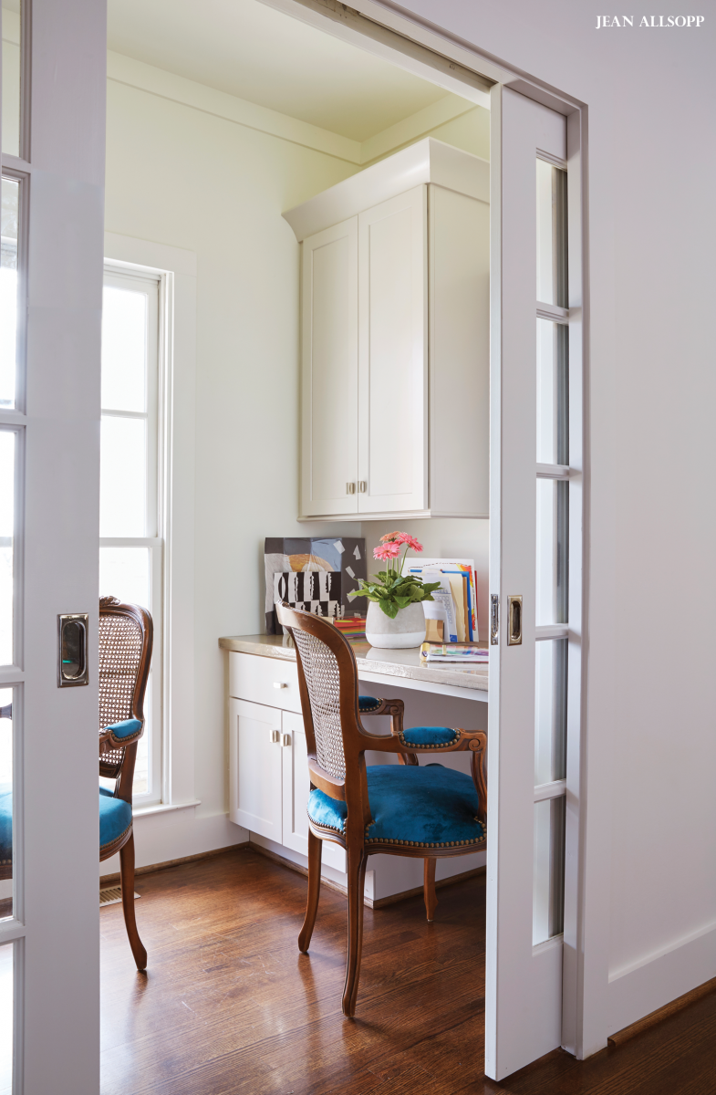
ABOVE LEFT In a minimal office space just off the kitchen, French doors keep the compact area feeling open, while peacock-blue upholstered chairs add a vibrant splash of color.
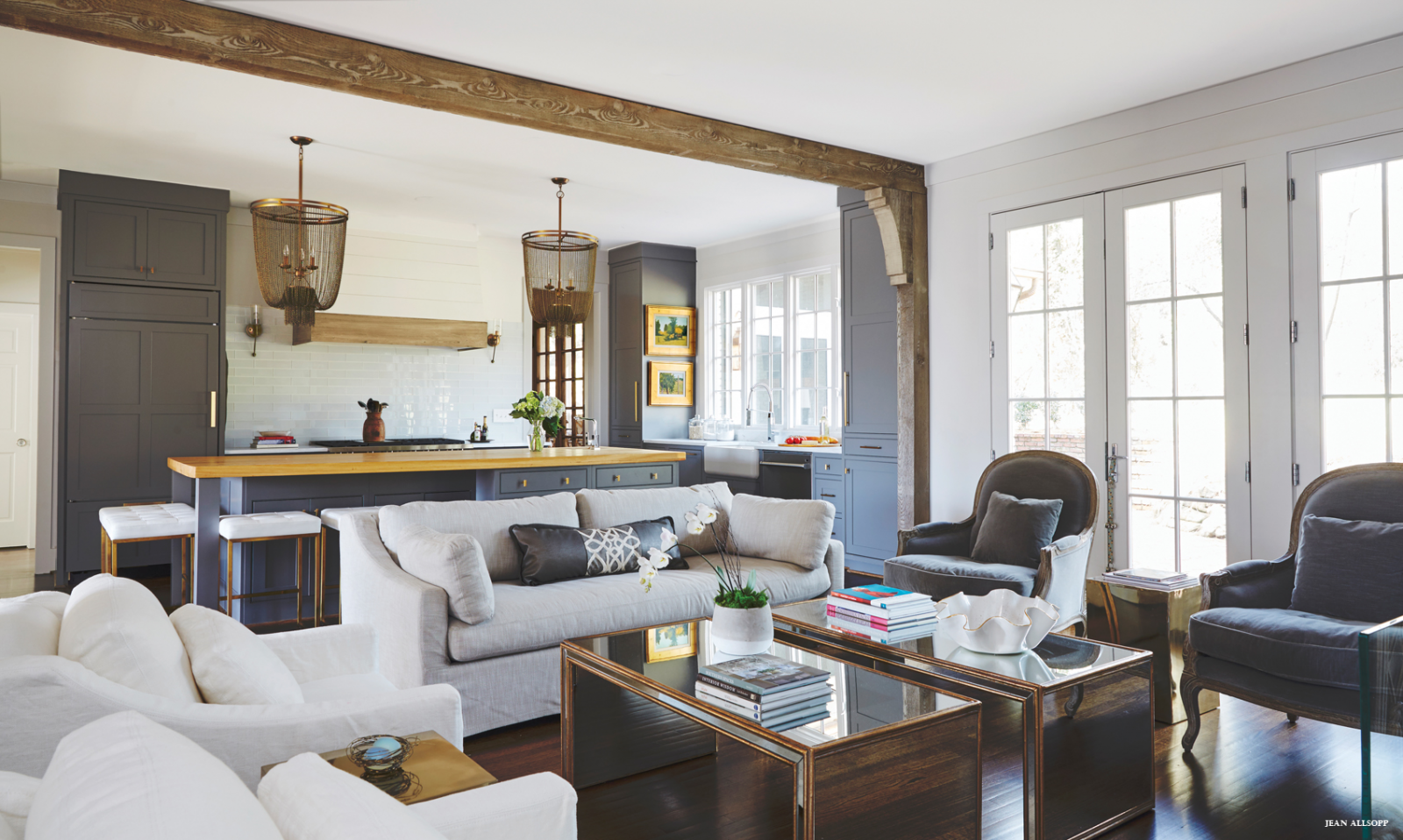
ABOVE RIGHT Appealing elements such as the Dutch door in the dining room and the exposed, custom-painted beams and island top in the kitchen add subtle textural interest.
“Jana likes color so much, and that’s fun for me. The philosophy here is that any piece in the house can be used anywhere else in the house. You can move a chair out of the master bedroom, put it in the den, and it still works. It’s such a dance.” — Shea Bryars
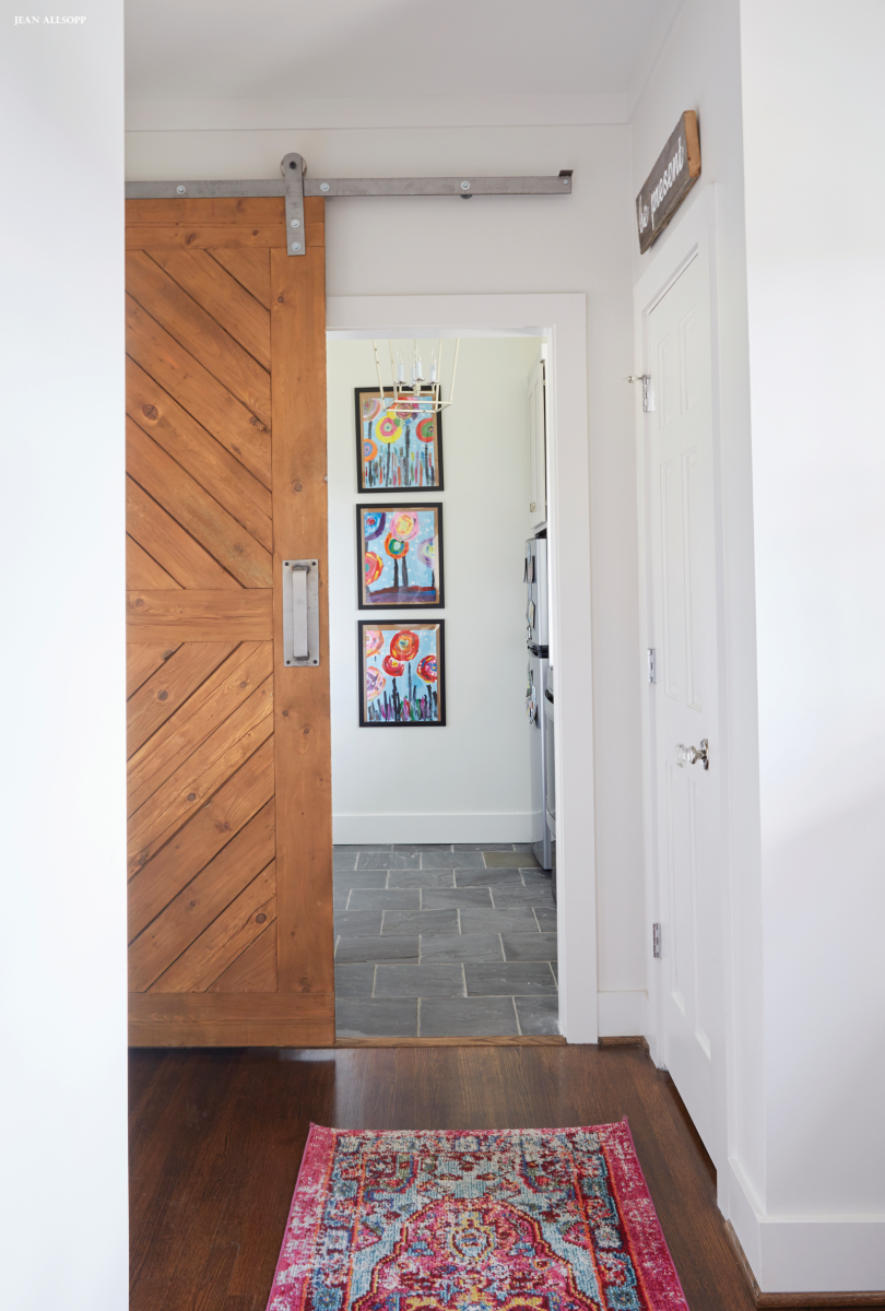
ABOVE LEFT In the laundry room, Shea added a reclaimed wood barn door she found at a shop in Mobile.
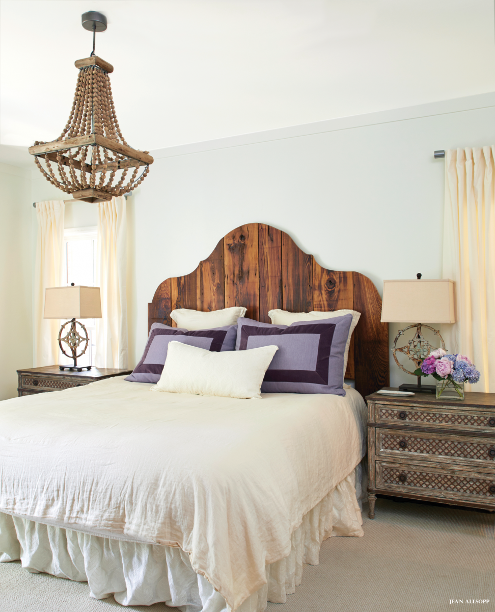
ABOVE RIGHT In the master bedroom, purple pillow shams and colorful accents add a wow factor to the otherwise neutral backdrop. The wood headboard has sentimental value to Carey, who grew up in Louisiana, where his grandfather had a barn crafted of cypress. When the dilapidated structure was razed, each of the grandchildren received some of the beautiful wood, which the Romes used for this focal-point piece.
ABOVE Turquoise and purple touches can be found throughout the Romes’ home, including in all three daughters’ bedrooms.
Photo by Laurey Glenn
RESOURCES Interior designer: Shea Bryars, Shea Bryars Design, 205.533.2268, sheabryarsdesign.comArchitect: Joe Ellis, DWELLing Architecture, 205.790.1389, dwellingarchitecture.comBuilder: David Siegel, Twin Construction, Inc., 205.802.3920, twincompanies.comSelect fabrics: King Cotton, kingcottonfabrics.comLandscape: Ramon Perez, 205.296.7706 Kitchen cabinets: Twin Cabinets, twincompanies.comCountertops, tile, and backsplash: Triton Stone Group, tritonstone.comPlumbing fixtures and appliances: Ferguson Bath, Kitchen & Lighting Gallery, ferguson.comBarn door: Charles Phillips Antiques and Architecturals, charlesphillipsantiques.com
BEFORE The plain-Jane exterior lacked charm thanks to tired landscaping and a drab color palette. AFTER The refreshed exterior includes a gray-and-cream paint job, expanded windows, new screened-in porch, and spruced-up landscaping. A carport (to the right) and half-story addition (to the left) were also discreetly tucked in.
Worldly details abound in the home, including a French architectural remnant that accents a doorway.
You shouldn’t judge a book by its cover. Nor should you judge a home by its exterior. At least that’s what Allyson Kirkpatrick’s Huntsville, Alabama, duplex proves. Drive by and you’ll see a pretty little rancher nestled into the town’s historic Twickenham District. But step inside and you’ll discover a one-of-a-kind home steeped in luxurious finishes and brimming with color, artwork, and antiques. And that’s no accident. Every inch of the design was meticulously planned by Allyson, who worked with Huntsville-based architect Darryl Bird to transform the sleepy duplex apartment into a home befitting an imaginative designer. (The other side was left untouched with Allyson’s friend renting that space.)
“The home, which belonged to my parents, was built as a duplex in the 1960s, ” says Allyson. “Since it’s in the historic district, we were very limited on what we could change about the exterior, roofline, and so forth.” Those limitations forced the duo to get creative with subtle upgrades, such as replacing windows to let in more light and taking ceilings to the rafters where they could. Inspired by circa 1800s Parisian homes, they reimagined the floor plans to include a central great room flanked by smaller, salon-style spaces. To add character in keeping with that European flair, they also incorporated heaps of architectural remnants (collected by Allyson during overseas antiquing trips) and rich treatments, such as tray ceilings, plaster walls, and bespoke millwork. Next came the fun part—layering in the antiques, many passed down to Allyson by her parents. “Design is all about surrounding yourself with pieces that hold meaning, ” she says. “I was thrilled to display so many items my parents loved.”
With the dust settled on the renovation and each treasured item perfectly in place, Allyson can finally say the nearly 9-month-long overhaul was worth the wait. “I love that you walk in and it instantly feels like you’ve entered another time and place.”
ABOVE LEFT The enveloping blue entryway contains a Venetian mirror and Italian campaign chairs.
ABOVE RIGHT A painting by Russian artist Murat Kaboulov inspired the great room’s jewel-tone palette. “I carried the painting with me—no small feat! —to showrooms while selecting furniture and accessories, ” Allyson says. The artwork is prominently displayed in the newly added recess of a library wall.
ABOVE LEFT Before: Low ceilings and small doorways left the house feeling cramped. After: Expanded windows, Lucite furnishings, and a gleaming brass fireplace reflect light at every turn. Allyson worked with Huntsville craftsman Mike Knox to perfect the look. “I love that it will obtain a rich patina over time.” A newly vaulted ceiling adds to the airy atmosphere.
ABOVE RIGHT Before: Ho-hum finishes and a mismatch of furniture resulted in a lifeless space. After: An ornate fireplace and coffered ceiling, along with a well-curated assortment of antiques, infuse the room with elegant panache.
ABOVE A Parisian-inspired salon features numerous Francophile antiques such as the centuries-old brass clock. Dainty X-back chairs feature French blue upholstery.
ABOVE The spacious bedroom (“I could have a dance party in here!” Allyson says) is anchored by two opulent pieces—a gilded Italian headboard purchased from Scott Antique Market and a Chinoiserie screen gifted to Allyson’s father by a Japanese diplomat. Cool pinks, blues, and grays emit a restful air, while a clover motif on the ceiling creates a “crown” for the German Muller Frères chandelier.
Allyson’s “jewel box”—a wet bar off the living room—is perhaps the most ingenious space in the home. The tiny alcove is chock-full of grand details, including the silk-tufted ceiling and Italian columns encased in Lucite. Flanking the mica-lined walls is a collection of crystal wine glasses collected across Europe by Allyson’s parents.
Statement Makers
Here’s how Allyson and architect Darryl Bird took ranch-home hallmarks, such as low ceilings, wet bars, small spaces, and one-story floor plans, up a notch with innovative, eye-catching details.
Take it to the rafters. In the great room, the ceiling was vaulted to maximize natural light and create a more open and expansive feel.
Decorate every last inch. Allyson and Darryl maximized the home’s wet bar off the living room with an arched ceiling and bold finishes such as antiqued mirrors and brass countertops. (The cocoon-like blue entryway possesses a similar effect.)
Focus on the ceilings. Where they couldn’t raise the roof, Allyson and Darryl made the most of the ranch home’s low-slung roofline with ceiling embellishments like the coffered beams in the living room and library and the clover-shaped tray ceiling in the master bedroom.
Sneak in storage space. In the addition off the back of the house, Darryl introduced a one-car garage with a storage room above. The stairwell leading to the second-story area features numerous pull-out drawers in what would have otherwise been unused space.
Meet Allyson Kirkpatrick
From I grew up as a military brat. Most of my childhood was spent in Europe, which certainly influenced my style.
Design Philosophy My goal is to transform a space into a personal oasis for the owner with favorite colors and meaningful items he or she has collected. The home should feel like it came together over a lifetime, not a few months.
Pattern & Color I take my color cue from a favorite focal point, such as artwork or a rug, and use it in various shades and textures throughout a room to unify elements. Then I add a few pops of a contrasting hue to bring some zing.
Favorite Accessory I like items that bounce and expand light, such as mirrors, brass, and Lucite pieces. I also can never pass up anything Chinoiserie.
She’s always been the fashionable one, ” Birmingham native Virginia Cheek says of her one-year-and-two-weeks-younger sister, Libby. “She was always having her closet raided by sisters and roommates because of all her great finds.” While fashion may be her sister’s talent, Virginia has an astute design sense all her own. So when Libby and her husband bought their first home, an 1,800-square-foot Edgewood cottage, she turned to Virginia, an interior designer, to make it shine. “Because I’m so familiar with her personal style, Libby thought I was the perfect person to translate that into her home environment, ” Virginia says.
When the couple purchased the cottage, built in 1930, it was far from looking and feeling like Libby. “It had a lake house vibe with moss greens and grays as the main colors, ” Virginia says of the three-bedroom, two-bath home. “Dark interiors are definitely not her taste.” Among the home’s redeeming qualities, however, was an addition on the back that includes a master suite, screened porch, and deck, as well as outdoor living areas that checked off a box on the couple’s wish list.
To achieve a lighter, brighter look inside, Virginia painted all the public spaces the same shade of warm white—Benjamin Moore’s China White. “That change gave the whole place a happier, cottage vibe, ” she says. “White lets spaces live a little larger than their actual footprint.” Plus, it gave her a clean canvas for assembling each room.
ABOVE A fresh color scheme and lighter art, furnishings, and fabrics opened up the space. A mirror above the mantel brings in more light.
ABOVE This is both breakfast and dining room, so I didn’t want it to feel too formal, ” Virginia says. “Libby found the table super on-sale. I like the glass because it feels light in the small room.” Vintage French chairs were painted white, and Virginia covered them in a pretty bohemian blue-and-white fabric. She topped the room with a substantial fixture from Circa Lighting. “Beware dinky fixtures, ” she says.
ABOVE Open shelving offers interest and a place to display Libby’s collection of flea-market copper. A butcher block island from The Home Depot takes the place of the table and offers additional work space and storage underneath.
When it came to furnishing the home, Virginia found inspiration in an unexpected place. “We started with a blue-and-white lamp given to my sister by her mother-in-law, ” the designer says. With the classic color scheme in place, the sisters filled the house with a variety of items, including found pieces, hand-me-downs from their “super traditional but not in an old-lady way” parents’ home, and new purchases. They reupholstered many pieces in modern performance fabrics, which Virginia carefully chose to keep the classic blue-and-white color palette from feeling staid. The living room sofa gained new life with a “very pale ticking that reads as a solid, ” Virginia says. And the room’s art is local—a commissioned painting by Catherine Booker Jones and a custom-made mirror.
One of the most curious features of the space is the handmade tile on the fireplace surround. “We purchased it on Etsy, ” says Virginia. “That was Libby’s idea. We had looked around at high-end designer and antique tile options, but they were were expensive for a starter home. She found a woman on Etsy who hand-paints tiles. We sent her samples of ones we liked to help her know what we wanted.”
Each room features an antique or two, such as a small table between bobbin chairs in the living room and a buffet and French chairs in the dining room. A hand-me-down-from-Mom table greets guests in the entry. “It’s Victorian, which I normally wouldn’t like, but it looks really fresh against white walls, ” Virginia says.
Nothing in the house feels too big for its space—even rugs were cut to fit. “We were specific about scale and maintaining walkways, ” Virginia says, noting that keeping furniture to the right size is key to having a small house feel comfortable rather than overstuffed.
ABOVE By eliminating a TV in the bedroom, Virginia was able to flip the space plan “and not block any windows, ” she says.
ABOVE The guest bath offers cottage simplicity with vintage floor tile and a pedestal sink. “All we did was change the light fixture and the mirror, ” Virginia says.
ABOVE A swinging daybed brings in cottage comforts—and some breathing room.
Lighten Up
1. Paint walls and trim the same color but different sheens (semi-gloss or glossy on trim) to trick the eye and make the room feel bigger.
2. Hang curtain rods at the crown molding to make ceilings feel taller.
3. Antiques are great, but be sure to mix in lighter furnishings, such as the white cocktail table, so you don’t have a room full of heavy, brown furniture.
4. Need a ceiling fan? Go for flush-mount and white. “I’ve done that with all my little cottage projects, ” says Virginia. “That way, you don’t really notice it.”
5. Lighting is important. “I put can lights in ceilings, and I always include dimmers, ” says Virginia. “Being able to dim or brightem the lights makes a huge difference, especially in older homes with 8-foot ceilings and small windows.”
Meet Virginia Cheek
From I grew up in Birmingham, and now I live and work in Atlanta.
Design Philosophy Every home should be unique to its owners. Success means the finished product actually looks like the clients—not like a photo shoot for a retailer.
White Walls One of these Benjamin Moore colors always works: China White, Bone White, Super White, Simply White, or Classic Gray.
Favorite Accessory For a small house, a couple of high-end pieces or heirloom antiques really do the trick. They add a layer of sophistication without feeling too fancy.
Best Advice A mistake people make in these 3/2 cottages is trying to fit furniture that’s too big. Sometimes furnishings that get passed down would make more sense in a larger home. If it’s beautiful and you love it, store it until you move.
RESOURCES Designer: Virginia Cheek, 404.530.9805, virginiacheek.comRugs: Hiltz-Lauber FireplaceTile: Etsy: tigercattiles Art in entry: Kathryn Cooper, kathryntaylorcooper.comLiving Room: Sconces: Visual Comfort Painting above sofa: Catherine Booker Jones, catherinejonesstudio.comAntiqued mirror above fireplace: Mirror-tique, mirror-tique.com Dining room chairs: Argent Antiques re-covered in Lisa Fine Textiles, argentantiques.com, lisafinetextiles.comMaster bedroom: Bed: Three Sheets Artwork flanking bed: Kristen Blakeney through Design Supply Shop, artgallery1930.com/designsupply/Bedside table lamps: Hiltz-Lauber
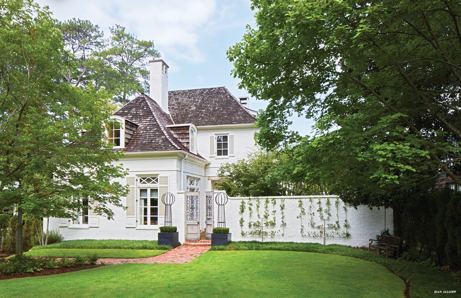
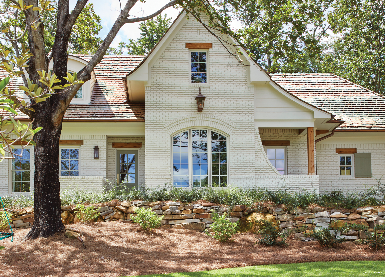
ABOVE Architect John Carraway helped Jeanne and Mabry Rogers design a classic French country look with a shake roof and stately white-painted brick. Placing the new house to the left of the lot and inserting a garden on the right not only created outdoor rooms for enjoying and entertaining but also gave the family the privacy they desired.
Every really talented architect knows that siting is absolutely key to designing a house. Jeanne Rogers and her husband, Mabry, discovered that when they began to consider renovating their existing home. The couple quickly realized they were more likely to get the house they wanted by purchasing the empty lot next door and building new. And while the lot kept them planted in the neighborhood they loved, it presented a challenge because of flanking houses, narrow depth, and close proximity to the street. The Rogers had hoped for some privacy, but constraints suggested otherwise. That’s where the expertise of architect John Carraway of Carraway & Associates came into play.
Instead of plopping the house in the center of the lot, John set it to one side. He says it was one of those “ah-ha” moments that seemed ridiculously evident once realized. The arrangement allowed John to give the Rogers the classic French-style home and secluded garden they desired. “There’s so much creativity and beauty in what John did, ” says Jeanne. “The courtyard garden not only gives us privacy from the street and neighbors, but it also connects the interiors to the outside. Every room looks out onto the courtyard.”
ABOVE LEFT The dining space shares the same herringbone-patterned pavers as the entryway, a flooring Jeanne loves because it reminds her of her childhood home. A simple English pedestal table is flanked by four classic French chairs, leaving the statement to be made by the antique Italian iron-and-wood chandelier.
ABOVE RIGHT The range is a standout with its sleek, sculptural hood. White quartz countertops maintain the serene palette, and a marble backsplash works as an element of modern art. The island, painted Sherwin-Williams Sealskin, underscores the marble’s gray vein.
ABOVE The living room features numerous windows that provide generous views of the garden. To bring in both an old and new feel, Jeanne incorporated a modern shelter mohair sofa with classic wingback chairs. A grouping of nine antique Italian bookplates anchors the space over the sofa.
Floor plan in place, Jeanne shifted her sights to the design. As an interior designer herself, she started by taking the advice she gives her own clients. “I tell my clients to put together a plan that blends what they love, ” Jeanne says. “In my case, I am drawn to clean lines and modern aesthetics with a mix of antiques. I like it when things have a story, so I incorporate antiques whenever possible. You should always layer in some history.”
Those antiques take residence throughout the house, from the French chest in the foyer and the Dutch desk in the living room to the Italian chandelier and sideboard in the dining room. “I collected these pieces over time, through various travels, ” says Jeanne. “They’re items I will want to hang on to forever.”
The designer juxtaposed those traditional pieces just enough modern touches, including keeping the mouldings throughout the home minimal. In the foyer, she added dimension with a lively leopard print on the stairwell. In the living room and master bedroom, she mixed in contemporary accent fabrics. The kitchen showcases an edgy light fixture. “I love creating the right balance between old and new, ” she says. “Here, it’s all enhanced by the beautiful garden views in each room.”
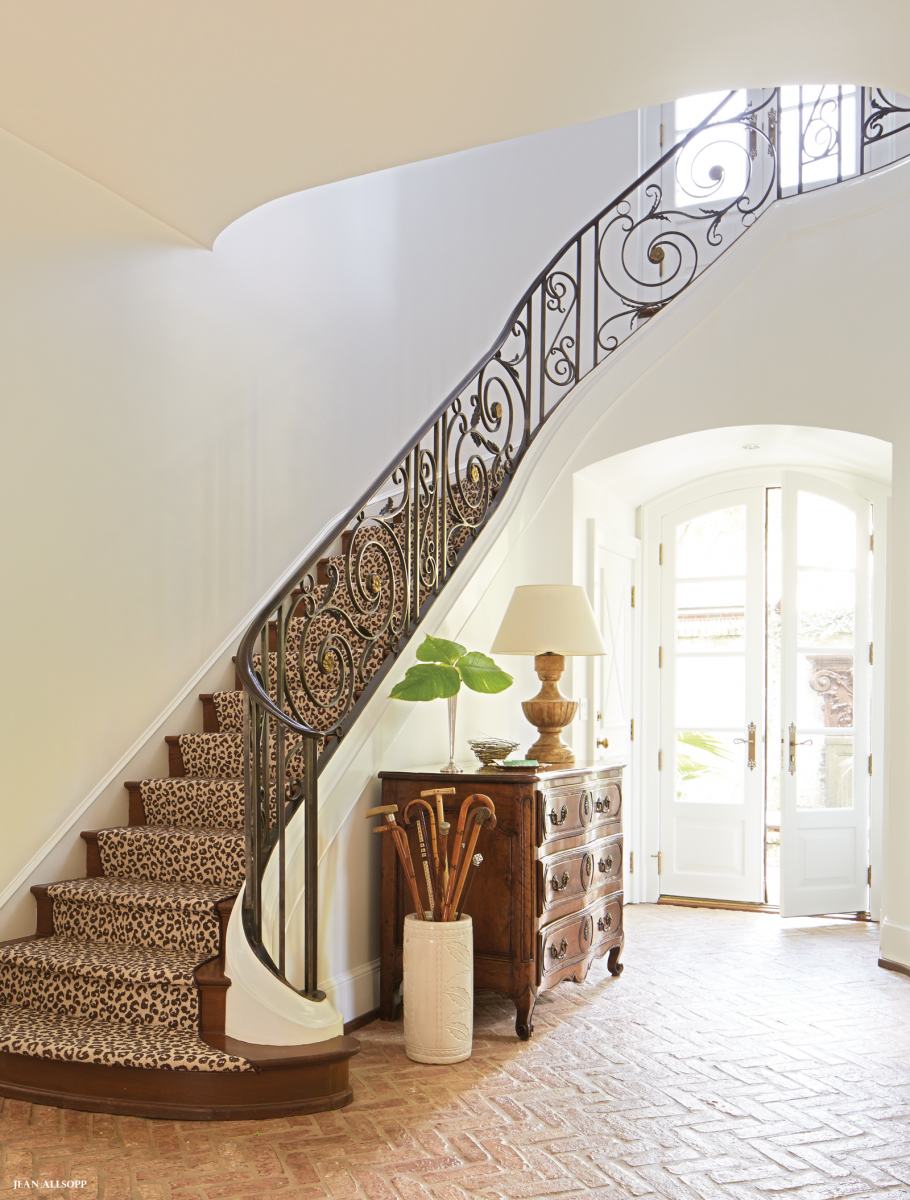
ABOVE LEFT The home’s entryway combines a mix of Jeanne’s favorite elements, including a collection of antique walking canes and an antique French chest. “A big chest helps anchor a space, and the wood provides warmth, ” she says. The classic leopard print from Hiltz-Lauber paves the staircase, adding modern contrast to the classic French railing custom-designed by Iron Stair Railing: Artistic Birmingham Iron. Oversized spliced brick pavers laid in a herringbone pattern recall a design in Jeanne’s childhood home.
ABOVE RIGHT The antique French mantel in the living room is one of the many pieces Jeanne has found during her travels over the years. A French basket weave mirror reflects the abundance of natural light.
ABOVE LEFT A highlight of the living room is an antique Dutch desk. An antique paneled door hangs above. “It’s one of those pieces you find and love and just figure out a way to use, ” Jeanne says.
ABOVE RIGHT Jeanne opted for a calm aesthetic in the master bedroom. Walls, floors, and bedding are light to accentuate the celadon green custom headboard. A rug from Paige Albright Orientals is layered over a Hiltz-Lauber carpet for added softness and dimension. Wall color: Pashmina by Benjamin Moore
ABOVE Every room in the home looks out onto the garden, a space that was critical in the original design of the home as it provides needed privacy while also letting in plenty of natural light. “The look of the garden has been changed so many times over the years. It’s gotten simpler, ” Jeanne says. “With so much going on in the house, it’s better for the garden to be simple.”
Time in a Garden
The courtyard garden is an integral part of the home’s design. Shifting the house to one side of the lot and incorporating the garden on the opposite side created seclusion from the street and neighbors. It also created a blissful utopia that became an extension of the home’s interior space. Here’s how horticulturist Kevin Webb of Prime Landscape Services helps keep it that way.
Keep it simple. The front wall of the garden includes just five different plants: rosemary, sweetbay magnolias, mondo grass, boxwoods, and three-tiered candelabra Gala apple trees. While the plants are few in number, they are used in large scale to best outfit the space.
Define the space. In creating an outdoor area, approach the space just like you would the interior by defining “rooms.” Here, the garden is obviously one big space, but it’s organized into three “rooms, ” and each has its own unique feel.
Think it through. Not just any pretty plant is ideal for any given garden. Here, Kevin used mondo grass where possible to have green grass year-round. Four Japanese maple trees in the center of the garden anchor the space and create a canopy for needed shade.
RESOURCES Designer: Jeanne Rogers, 205.305.5243. Most fabrics and furnishings available through designer. Architect: John Carraway, Carraway & Associates 205.933.2114 Builder: David Camp, Camp Construction Landscape: Prime Landscape Services: DBA Webb Garden Design, 205.305.6517 Kitchen architect: Sissy Austin, Austin & Company, 205. 637.6048 Interior wall color: Simply White by Benjamin Moore Living Room:White Chinese vases: Circa Interiors & Antiques Sisal rug: Hiltz-Lauber Kitchen: Rug: Paige Albright Orientals Appliances: Ferguson Bath, Kitchen & Lighting Gallery Cabinet hardware: Brandino Brass Island Paint Color: Sealskin by Sherwin-Williams Master Bedroom: Light fixture: Circa Interiors & Antiques Bench: Henhouse Antiques Throw: Three Sheets
Photography by Jean Allsopp and Max Kim-bee // Styling by Liz Strong
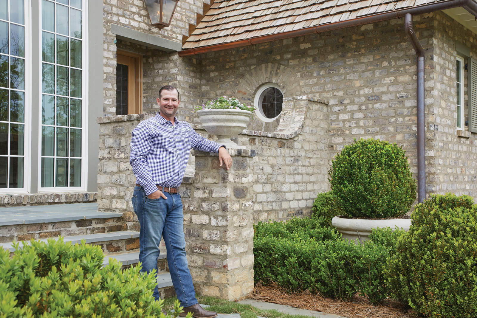
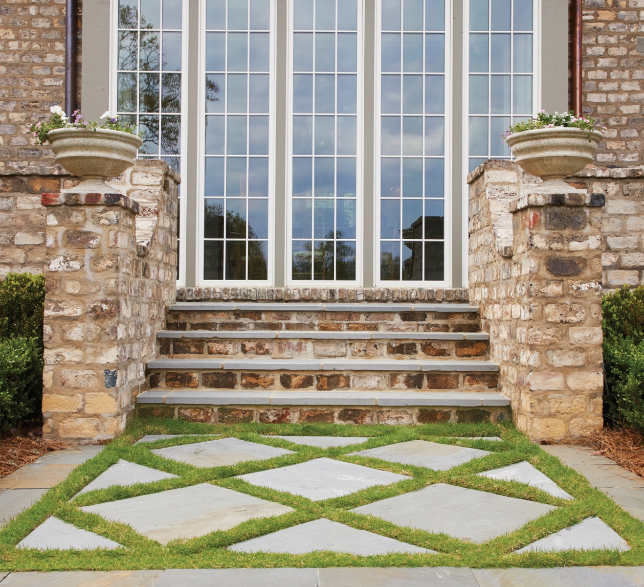
Landscape Design: Brent Donaldson // Builder: Davis Construction Services // Windows: Southern Sash // Brick: Evolutia // Cedar Shingles: FireRock // Lanterns: Ferguson Bath, Kitchen & Lighting Gallery // Front Door: Chris Hamm, Hamm’s Custom Wood Products
There is an old saying that if you can make a living doing what you love to do, it will never feel like work. Brent Donaldson of Donaldson Landscape & Design is living proof of that adage. “Honestly, in my down time, if I’m not playing with my kids, I’m drawing landscape plans or going through landscape design books, ” he says.
No matter where Brent goes, he looks for—and finds—inspiration at every turn. Whether traveling to the beach or New York City or Austin, Texas, the designer comes home with new ideas. “I like to re-create interesting things I have seen on my trips, ” he says.
Most of Brent’s clients live in Mountain Brook, and many are repeat customers. “I have clients who love what I do and trust me to create something really special for them, ” he says. “That freedom is one of my favorite parts of the business.”
More than just a designer and installer of plant material, Brent can tackle almost any part of a home’s exterior. From building arbors and creating hardscapes to improving drainage and installing uplighting, his design arsenal has breadth and depth. And his work is intentional and with purpose. “I’ve had clients call me to redo the yard of a house that they have just purchased, ” Brent says. “I always tell them to live in the house and in the yard for at least a year before making any major changes. They need to see how they use the space. We want to create an exterior design that works around the way they live, not the way the previous owner did.” And while this approach may seem unconventional, Brent’s clients can vouch for the fact that it has stood the test of time. After all, for this landscape designer, the end result is about more than just beauty— it’s also about functionality.
Brent’s Rules for Classic Design
Less really is more
I work with a lot of younger families who want their yards to look clean and streamlined. They don’t want ‘fluffy’ landscaping with layers upon layers. These streamlined designs have the added benefit of being easier to maintain as well.
Put a modern twist on traditional Southern
One of the ways I implement this approach is to take three 36-inch concrete pots, add boxwoods and uplighting, and place them in a neat row, maybe in an area with pea gravel. It’s simple, but it makes a statement.
Go with your gut
It took me a long time to realize that I need to trust my first instinct on a design. I can look at a piece of property and just know what I want to do and what will work. It just flows. I am lucky that I have clients who trust my instincts as much as I do.
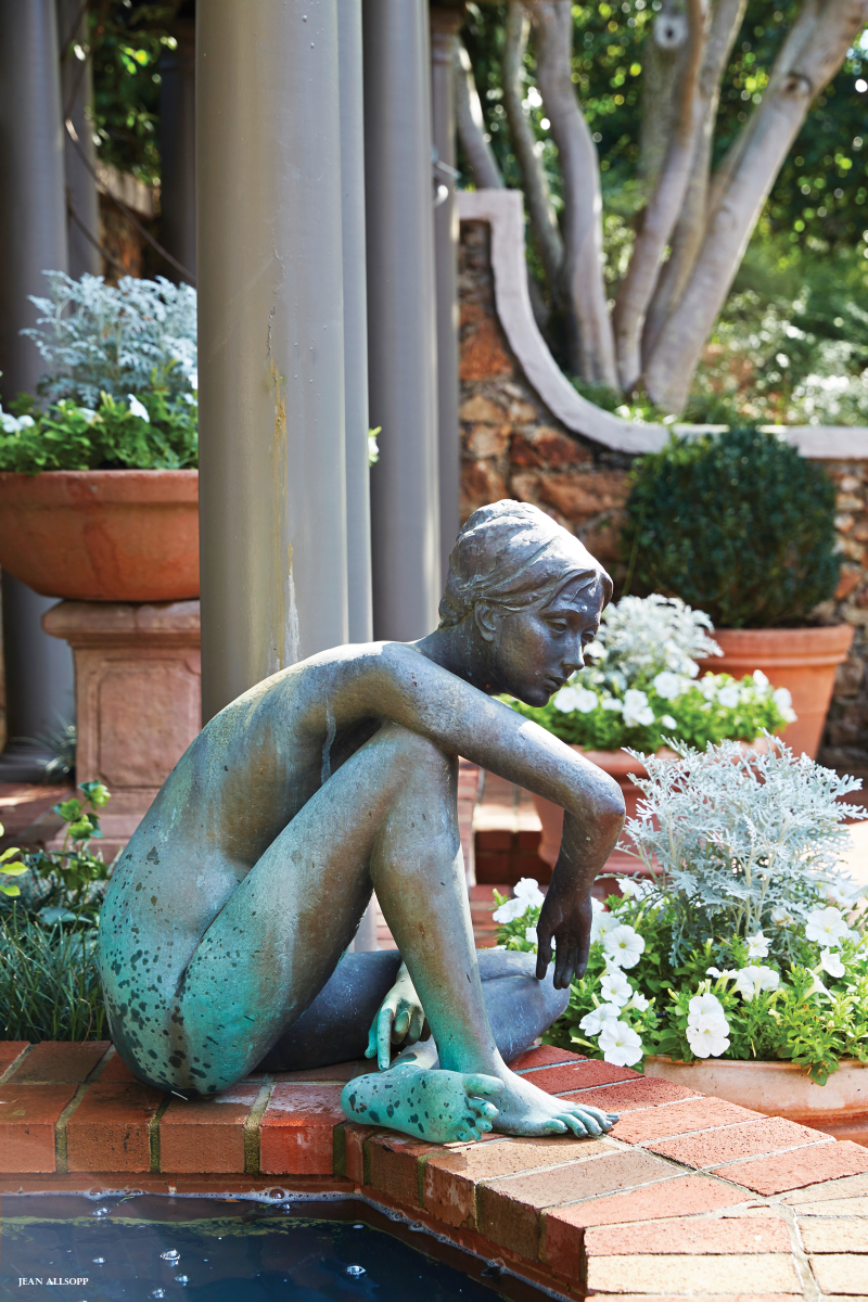
Vintage cast-iron urns flank the original, ornate entrance screen. Photos by Jean Allsopp
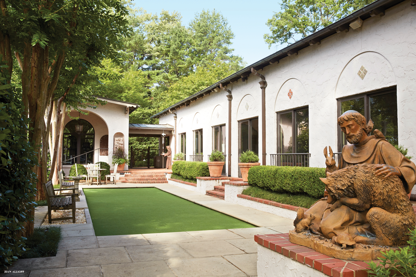
The Spanish Colonial Revival style has an undeniable glamour that rose to popularity in the 1920s, especially in California. With its Mediterranean roots, the architecture often highlights outdoor spaces and greenery. Such elements served as inspiration for garden designer Kelly Hulsey as she renewed the surroundings of a fine Spanish Colonial Revival manor, the Mountain Brook home of Tom Lowder and Susan Carrington.
Built in 1928, the handsome house was purchased by Tom in 1986. Over the years, it received sensitive additions by Birmingham architects John Carraway and James Carter. The result could easily have been transported from Beverly Hills—or from Holman Ranch, the Carmel Valley property Tom and his late wife, Jarman, purchased a dozen years ago. The ranch has a house of the same style and vintage as this one, as well as vineyards and olive groves that produce fine wine and oil.
The graceful 1928 design features arched openings and picturesque details. Garden designer Kelly Hulsey put in a lush lawn dotted with oaks and an emerald arborvitae at the far corner. Creeping fig cloaks the low wall around the terrace.
The garden project represented renewal in more ways than one. Tom and Susan met after both lost their spouses to neurodegenerative diseases. When they married, she moved to Birmingham from Virginia and, with his three sons and her three daughters, “formed a modern Brady Bunch family, ” Susan says. “Being new to Birmingham, I loved the history and setting of this house. The garden project was a way to make it my own.”
In the home’s overgrown landscape, some of the old plantings were assets; others, such as the front yard’s large but decrepit hackberry trees, needed to be removed. With the trees gone, the south-facing front of the house “went from full shade to full sun, ” Susan says. “I was pulling plants out but didn’t know what to put in. That’s when Kelly got involved. She would come over, walk around, and spend time getting to know the place, and us. She’s like a plant whisperer.”
The now-sunny front got a lush new lawn, overcup oaks, and magnolias to fill a gap at the property line. (“Good screens make good neighbors, ” Kelly says.) The designer planted a large maple tree on the left of the front terrace to balance the mature one to the right of the entrance. “I like to work incrementally, putting in plants in stages to see what will go well together, ” she says.
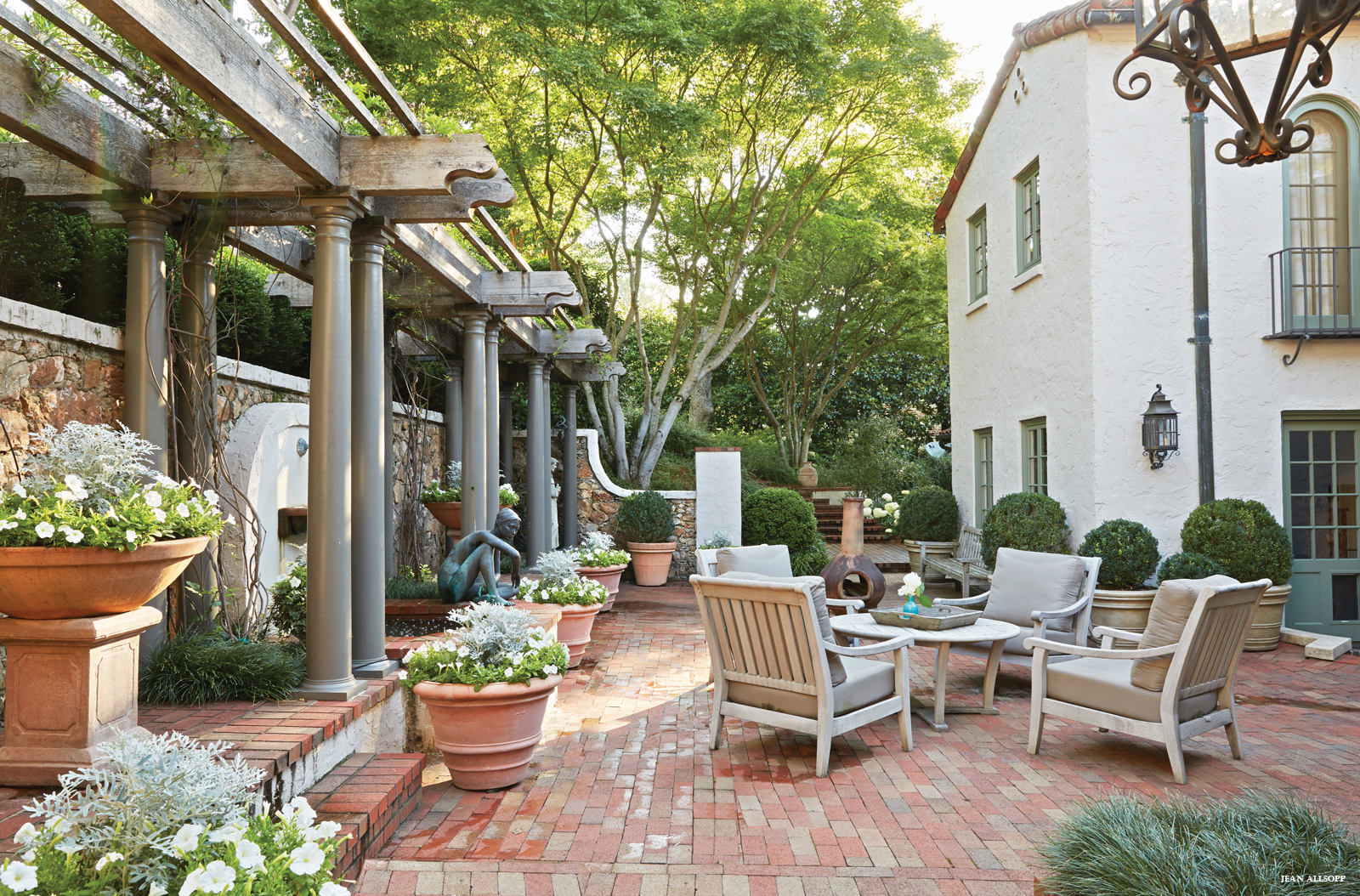
Echoing the red tile roof, the red-brick courtyard behind the original house boasts a long arbor, a fountain, and a covered loggia where Tom and Susan often dine. Kelly adorned the courtyard with ample containers planted with large globular boxwoods and decorative plants that Susan swaps out three times a year.
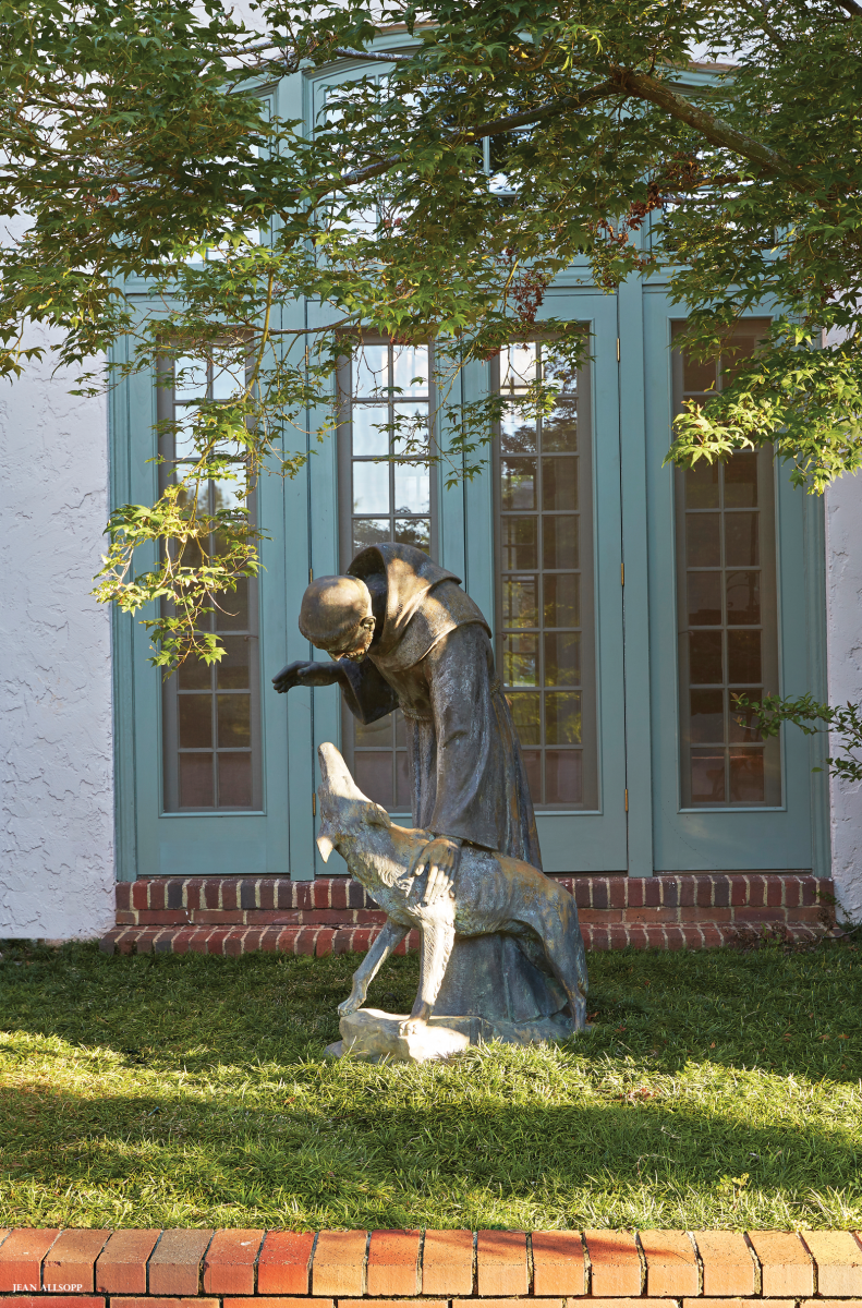
Steps at either end of the courtyard lead to an upper terrace where Kelly installed drainage to keep a new paver-framed bocce court dry. Here and elsewhere on the grounds sit bronze sculptures Tom has collected over the years. Some depict St. Francis, a symbol of harmony with nature and an apt companion to the style since Franciscan monks founded Spanish Colonial missions from Mexico to northern California.
“We wanted to stay true to the house but reflect the way we live, indoors and out, with a focus on entertaining family and friends, ” Susan says. “What Kelly did perfectly suits the house and our lifestyle.”
A statue of St. Francis (artist unknown), presides over the upper terrace. Dedicated to recreation, the buildings along the terrace house a gym and an indoor pool. Lofty crepe myrtles, spectator benches, and suitably spherical boxwoods edge the bocce court. Peacock Pavers create the frame around the court.St. Francis and the Wolf of Gubbio by Giovanni Cappelletti.Bronze sculptures, some purchased by Tom Lowder from the historic Marinelli Foundry in Florence, Italy, serve as artful accents. Sculptures include Resting Model by Aroldo Bellini, St. Francis and the Wolf of Gubbio by Giovanni Cappelletti. Resting Model by Aroldo Bellini; near the front door.A fountain and a pergola trained with Carolina jasmine create a beautiful backdrop for the spacious courtyard behind the house, where terra-cotta containers hold mature boxwoods and decorative plants that change every few months. Outdoor furniture from Blackjack Gardens creates an intimate dining area just off the kitchen.
RESOURCES: Garden design: Kelly Hulsey, hulseygardens.com // Lanterns and metalwork: Robert Lehman Studio, 205.324.0901
Sleek new cabinets (finished in auto paint), reallocation of appliances, and a new center island make the kitchen fun and more functional. Photos by Jean Allsopp
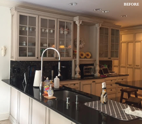
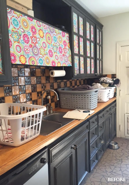
Perrie Tomlin and her husband, Christopher, have five dogs, a college-age daughter, and two boys—make that two still-growing, athletic boys. For Perrie, that means a lot of time in the kitchen and laundry room—two outdated rooms (see photos below) that begged for a makeover. “I wanted to make them fun places to be, ” Perrie says, “especially since I am in there so much.”
Calling on designer Katrina Porter, Perrie shared her design loves to help harness her vision. “I’m a Lilly girl and a minimalist, ” Perrie told her. She also wanted to replicate the look of her mother’s shiny Formica kitchen cabinets. “When I was growing up, I always thought they were awesome, ” Perrie says. And she wished to incorporate influences of her Birmingham decorator grandmother, Doris Schuler. “Yellow was her signature color, ” she says. “I had saved one can of her signature mix so we could get the right color for the laundry room cabinets.”
The result is a summertime vibe that’s as fresh as, well, clean laundry. It’s a place Perrie often finds herself, even when the chores are done. “I can close the door and hide from my kids and dogs, ” she laughs. “Sometimes I like to sit in there with a glass of wine and just look at it.”
Chores are way more fun (and easy) with vibrant yellow walls, a palm-print wallpaper, graphic floor tiles, two washer/dryer sets, and a doggie bath. The only thing missing is the drink umbrella.
Kitchen + Laundry Before
KITCHEN The awkward layout and heavy look of the cabinetry went against the owner’s aesthetic. The pantry offered lots of space but little appeal. Heavy trim weighed down the cabinetry.
LAUNDRY ROOM The dark cabinets, dated tiles, and task sink were certainly serviceable, but they didn’t offer Perrie the cheery work space she craved.


 Meet Allyson Kirkpatrick