The homeowner knew she wanted an island, but she also knew she didn’t want anyone to sit at it. She prefers that her family sits at the kitchen table together. Instead of stools, this custom island includes deep drawers that store dishes for entertaining. Photos by Jean Allsopp
Laurie Fulkerson difference maker
HIRE A PROFESSIONAL Laurie suggests bringing a designer on board in the early days of your project planning. Having a design in place helps your contractor give an accurate estimate of price and time frame.
CHOOSE MARBLE “I love marble because it’s timeless,” says Laurie. “It’s going to be just as pretty in a hundred years as it is today.” She used Crema Nuvolatta from Surface One in this kitchen.
SAVE SPACE WITH A CONVECTION OVEN This all-in-one appliance includes a microwave to use regularly, as well as a second oven.
BE PLAYFUL “I have found that when you use a unique design on the cabinet hardware, it is one of the first things that gets noticed,” says Laurie.
What Makes it Transitional
NEUTRAL PALETTE Benjamin Moore “Linen White” was already used in the house, so Laurie chose to carry the creamy paint color into the kitchen. The walls, trim, and ceiling read clean and calm in this hue. Against this neutral base, other elements create contrast.
STREAMLINED CABINETRY Cabinets by Parsons Custom Cabinetry feature a low-profile design that allows them to blend in to the scenery of the kitchen. White oak differentiates the bar cabinets from the painted kitchen area. Sliding glass doors display the client’s glassware collection in a built-in reminiscent of a hutch. The curved lines and intricate carvings on the door designs of these special-area installations set them apart from the kitchen cabinets.
“When I think of transitional, I think of timeless with just a little bit of edge to make it different.” – Laurie Fulkerson
NATURAL AND MANUFACTURED Fulkerson used a mix of materials to add interest and texture to the kitchen’s crisp palette. The dark tone of the herringbone hardwood flooring is paired with a custom light stain on the white oak of the island. Wood reeding on the island, the base of the range hood, and in the bar cabinets contributes an organic texture. A stainless steel, single-basin sink with brass accents from Texas Lightsmith balances the natural elements.
CONTRASTING LIGHTING The homeowner kept the existing black-and-gold Currey & Company light fixture over the breakfast table, and Laurie decided to use it as inspiration. Modern, adjustable sconces for the sink wall mimic the dramatic chandelier, while a more traditional candle-inspired, multi-light fixture hangs over the island.
The beautiful view off the back of the house justified new floor-to-ceiling Lincoln clad windows from Alpha Millworks in the breakfast room which, with the built-in bar, sits at the opposite end of the island from the range.
DON’T FORGET THE LAUNDRY For the homeowner, a mom to three hard-playing kids, Laurie wanted laundry to feel like less of a chore by making the space beautiful. Farrow & Ball “Light Blue” paint transformed the cabinets, and eccentric peacock wallpaper gave the walls new life. Laurie convinced the homeowner to give the pattern a try because she felt it fit her personality perfectly.
RESOURCES Designer: Laurie Fulkerson, Twin Interiors of Twin Construction Construction: Twin Construction Cabinets: Parsons Custom Cabinetry
There was one non-negotiable design factor for the custom island—the clients’ entire family had to be able to sit around it. Five Serena & Lily stools with easily wipeable vinyl cushions tuck under the island’s overhang. Designer Ashley Gilbreath ensured that the island was scaled appropriately for the kitchen. Photos by Laurey Glenn
Ashley Gilbreathfinding balance
FOCUS ON FUNCTION Make a list of what your kitchen has to do. Do you need a double oven? A separate fridge and freezer? Your definitive list lets you know what tools must go into the space.
KNOW YOUR OPTIONS “There are so many cool appliance options out there, so don’t just go with something because you’ve heard of it,” Ashley says. “Do your research and be nit-picky.”
When guests open the front door, they have a direct line of sight to the kitchen table and on to the living room beyond. This high-traffic area had to be open and high-functioning. Banquettes are a great way to maximize seating and create a visual break in a space. Ashley says kids especially love to pile onto a banquette at mealtime.
VISUAL VALUE Appliances are typically dark, and their visual weight can distract from an otherwise light kitchen. Consider using cabinet-front panels to conceal them as Ashley did in this kitchen.
STAY BALANCED “When you’re positioning things, make sure you’re keeping your center line,” Ashley says. The statement range hood in this kitchen is balanced by a fireplace situated directly across the room.
“We tried to make sure your eye goes to the right places at the right time. The range hood should be first. Then, it’s really a marriage of your wall colors, trim color, cabinet color, cabinet hardware, and flooring.” – Ashley Gilbreath
What Makes It Traditional
STATEMENT RANGE HOOD “The range hood is really your artwork in a kitchen,” Ashley says. Because it takes up a lot of real estate, it is typically what first draws attention. This wooden range hood with applied brass strips definitely take center stage.
LARGE COMPLEMENTARY RANGE This 48-inch Ilve range from Ferguson reinforces the traditional style of the kitchen. The brass finishes echo the hood outline, cabinet hardware, and sink faucet for a cohesive look.
BLEND OF NEUTRALS “Sometimes a mix of neutrals is the most difficult thing to execute correctly,” says Ashley. She used Farrow & Ball “Skimming Stone” for the cabinetry, Benjamin Moore “Thunder” for the hood, and “Mystery White” marble from Cottage Supply Company for the countertops and backsplash. When the undertones of the various hues align as desired, the kitchen appears timeless.
DETAILED CABINETS The inset cabinet details and furniture-like feet add an extra traditional touch to the kitchen. The upper-most cabinets, intended for storing occasional items, have brass mesh on their door fronts to draw the eye up with a bit of metallic shimmer. Grace Fabrications brought these thoughtful cabinet designs to life.
MARBLE EVERYWHERE After the design was finalized, Ashley’s first step was finding a slab that would perfectly work with the space. The marble was fabricated into cabinet countertops, the island countertop, and a backsplash.
DON’T FORGET THE BAR This bar/butler’s pantry is the pass-through between the kitchen and dining room. Grasscloth wallcovering and a soapstone countertop differentiate the space from the kitchen. Using lighting and accessories from Parish Shoppe and art from Catie Radney, Ashley created a space that she says feels Southern and classic but also young and fun.
RESOURCES Interior designer: Ashley Gilbreath, Ashley Gilbreath Interior Design Builder: Bob Hastings, Hastings Construction, Inc. Cabinets: Cole Reese, Grace FabricationsCountertops: Cottage Supply Company Appliances: Ferguson Plumbing fixtures: Fixtures & Finishes
Mary Lauda’s original design plan called for custom fabricated brass legs for the island, but the brass market fluctuated during the process. With the original quote inflated, the design team chose carved wood legs instead. “I like them even better,” says Mary Lauda. “They’re clean and classic, and they let your eye travel to the other details in the room.” Photos by Jean Allsopp
Mary Lauda Corwin kitchen prep
BE PREPARED “Your kitchen should be there to support the way you cook and live,” Mary Lauda says. Since these clients enjoy entertaining, this kitchen includes two dishwashers to facilitate easy cleanup.
BE PATIENT AND SAVE UP Mary Lauda advises tackling a kitchen renovation all at once instead of splitting projects into phases. “Small phases may cause you to cut corners or end up costing more in the long run.”
GET IN THE MOOD Create a mood board of fixtures, finishes, and paint colors to ensure everything works together before the install.
Design Tip: Mary Lauda doesn’t have a never-fail paint color, but she starts by considering Benjamin Moore “Pale Oak” for walls and Benjamin Moore “White Dove” for cabinets in her design.
What Makes it Country French
RECESSED RANGE NOOK A 60-inch Wolf range fits perfectly into a quartzite nook beneath an understated plaster hood. “It’s cozy and reminiscent of something you might find in a French home in the countryside,” Mary Lauda says. The nook also features a shelf for spices, oils, and accessories.
WASHED WOOD Ceiling beams and flooring in a washed wood lend warmth and texture to the space. These features stand out just enough against the soft palette of the kitchen. Light fixtures secured to the beams hang prominently over the island.
CHINA CABINETS Glass-door cabinets painted Benjamin Moore “White Dove” are accessorized with cremone bolts from Brandino Brass. “The arch at the top of the cabinets makes them look more like furniture rather than just another cabinet,” Mary Lauda says. With internal LED lighting, the cabinets put elegant china and glassware on full display.
Design Tip: Leathered stone gives countertops depth and texture while retaining its natural character. This kitchen uses “Bianco Supremo,” a leathered quartzite.
BRIDGE FAUCET A Perrin & Rowe bridge faucet channels a timeless style. This type of faucet, patterned after early 20th-century designs, has old-world charm that pairs well with the historical designs of the apron-front sink and marble-look countertops.
MIXED METALS Mary Lauda selected polished nickel for plumbing, antique brass for hardware, and bronze for light fixtures. “It gives the room a layered, classic look that is in keeping with the rest of the home, which has a beautiful mix of antiques and newer pieces,” she says.
RESOURCES Kitchen design:Mary Lauda Corwin, Toulmin Cabinetry & Design Builder: Michael Young, Toulmin Homes Countertops: Mega Granite & Marble Flooring: Russell S. Lee Flooring America Tile install: Jimmy Swindle, Floors Plus LLC Home design: Clem Burch Home Design Interior decorator: Kellyn Lee, Lampadas Living
The built-in bench and accompanying table and chairs form a cozy nook in the kitchen. Piles of pillows in light tones make it a comfortable spot for lingering over breakfast. The scale and style of the clients’ existing table and chairs fit the new design. Photos by Adam Macchia
Tips from Mark and Cristi Pledger kitchen connoisseurs
HIRE AN ARCHITECT An architect can help you think through how you and your family will utilize a space and then design accordingly. This professional may also have unique ideas of how to best use square footage.
RESEARCH Gather images of kitchens you love to help share your vision, but don’t be afraid to follow your heart rather than the current styles. In this kitchen, the strategy was “something very classic rather than trendy,” says Mark.
CALM DOWN In terms of paint colors, the Pledgers tend to lean more toward a monochromatic scheme. “We generally like for the walls and cabinetry in kitchens to be the same or similar colors,” Mark says. “It visually keeps the space calm.”
HIDE OUT Hiding appliances behind cabinet door fronts works beautifully in classic-style kitchens. “It changes the feel when appliances have matching wood panels,” says Mark. This particular kitchen even features a concealed wine fridge.
A custom range hood by Jackson Forge fulfilled the clients’ desire for a beautiful and interesting replacement for their existing stainless steel hood. The Pledgers moved the windows on either side of the range out by 7 inches to accommodate the upper cabinets that flank the hood. This small move made a big difference and “knit together all three cabinetry walls,” Mark says.
What Makes It Farmhouse
BEADBOARD In searching for classic kitchens as inspiration, the clients fell in love with painted beadboard. In this space, beadboard paneling appears on the backsplashes and the built-in bench.
FARMHOUSE SINK The epitome of farmhouse style, a fireclay apron-front sink from Shaws teams up with a Waterworks “Easton” bridge faucet in polished nickel.
TRADITIONAL CABINETRY Prior to its renovation, the kitchen had little storage with limited upper cabinets that included a poor mix of modern and traditional details. The cabinetry got a full makeover complete with bracketing, molding, and new doors. Custom brackets support the upper cabinets and add to the classic style of the overall space. The upper cabinets are framed by crown molding at the ceiling and a more delicate molding where the cabinet meets the brackets. Cabinet doors are set within a face frame rather than overlaid.
INTENTIONAL COLOR The clients didn’t want their kitchen to be a white box, so they brought in a bit of color. Variations of creams and muted greens in the pillows, cushions, and accessories make the space feel seamlessly connected to the family room and dining room, while the dials on the stove add a fun, unexpected pop of red.
SOAPSTONE COUNTERTOPS Dark soapstone countertops from Triton Stone make a statement against the light cabinetry, and their undertone ties into the kitchen’s overall palette. Soapstone can be found in many color options with or without veining and also provides increased durability compared to granite.
LIMITED STAINLESS STEEL The Pledgers wanted to minimize the kitchen’s use of contemporary-feeling stainless steel. Instead of choosing a traditional, stainless-wrapped range, they opted for a cooktop and wall ovens across the room from each other. This spreads the stainless look around the room to make it less visually dominant. They also replaced the existing stainless range hood with a custom piece made from patinated steel.
RESOURCES Architects: Mark Pledger and Cristi Pledger, Pledger Architect Contractor: Mitch Bradford, Saunders Bradford Cabinets: Aaron Lane, Lane Woodworking Tile installation: Somerset Tile Stone installation: Alabama Stone WorksCustom range hood: Brady Jackson, Jackson Forge Plumbing fixtures: Fixtures & Finishes
2 cups blueberries 1 tablespoon sugar 1 tablespoon lemon juice 1 half-gallon light vanilla ice cream or frozen yogurt 1 cup roasted shelled pistachios with sea salt, coarsley chopped
1. Combine blueberries, sugar, and lemon juice in a saucepan over medium heat. Cook 5 to 7 minutes or until berries burst and become syrupy. Allow to cool.
2. Thaw ice cream at room temperature for 10 to 15 minutes, or until it is soft enough to remove from the carton. Place slightly thawed ice cream in a large bowl. Add blueberry mixture; then fold in the pistachios. Combine until all is incorporated. (Don’t worry if there are a few spots of the vanilla peeking through here and there. It will appear “marbleized” when you begin to scoop.)
3. Place in an airtight container in the freezer for several hours until the ice cream is firm enough to scoop. Makes about 9 cups
LEARN FROM LESLIE: I’m always glad when I’ve taken the time to pre-scoop the ice cream for any dessert with company. There’s something about scooping “in the heat of the moment” that is never enjoyable.
To eliminate extra dishes, serve this beautiful ice cream in a waffle bowl. These “sweet” bowls are found with the ice cream cones at the grocery store, and they come in several sizes.
This garden home near English Village was tight on space, but thanks to thoughtful ideas, it makes a big punch. Channeling the design of Alys Beach, Peter created a neat alley with FireRock pavers and lined the pathway with crisp, square containers (set off by Mexican beach pebbles) filled with Yew, boxwood topiaries, and a trough-turned-fountain from Architectural Heritage. An apple espalier serves as a focal point on the far wall. Home design: architect Kelvin Terry; Builder, Russell Building
Classic Georgian Courtyard and Entry
Working around mature crape myrtles and a very happy pyracantha climbing up the side of the house, Peter reclaimed what was once an undefined garden space and transformed it into a tranquil seating area. “The wife is from Louisiana so we sourced the old New Orleans brick for the wall and topped the opening with antique pineapple finials. The fountain was a former sugar kettle, also from New Orleans. Furnishings: Mark Kennamer Designs
An arrival courtyard greets guests at the front of the house (above). “I wanted to create an inviting spot and some interest with the boxwoods and bench without taking away from the great architecture and reclaimed brick,” Peter says.
1920s Estate Garden
When Peter and architect Hank Long embarked on this estate home’s front garden, backyard, and pool renovation, Peter says the landscape was completely overwhelmed with plantings. “We wanted to show how large the space was and give it an open feel,” Peter says. In front, stalwart oaks and a herringbone-patterned brick driveway were the only keepers, when redesigning the entrance to this grand 1920s house on Fairway Drive in Mountain Brook. “We simplified the landscape to put the focus on the house,” Peter says. We planted more oaks, and looked to a classic palette of plants: zoyzia grass, boxwood, and hydrangeas.
For the pool area, he removed gangly pink and purple crape myrtles and replaced them with a green lawn studded with FireRock pavers. “A holly hedge across the back of the property creates a living wall without confining the airy space,” says Peter. Transitional spaces were key to uniting the front and back areas. Peter designed a pergola and gate on the side of the house to welcome guests to the back garden. Here, he created an allée of tree form Nellie Stevens Hollies, winter gem boxwoods, and limelight hydrangeas along with a path of Alabama bluestone pavers. House, cabana, and pool refurbishment: Architect Hank Long; Pool Pavers: FireRock; Pool furniture: Summer Classics; Builder: Day Star Construction
Colonial Garden and Outdoor Kitchen
This traditional home is located in a family-friendly neighborhood where kids play frequently. To make this front lawn both pretty and kid safe, Peter designed a front gate and hedge of azaleas to act as a fence.
“I love bringing new ideas to a garden to refresh older homes,” Peter says. Here, he introduced bluestone pavers, custom planters filled with boxwood, and annabelle hydrangeas.
For the outdoor kitchen, Peter worked with designer Alleen Neighbors and builder Chris Franks. They relocated a door and replaced it with the circular window which allowed for a patio close to the kitchen.“I like for the grill area to look good,” Peter says. “When it looks good and is part of the landscape, people like to hang out and the chef isn’t outcast to a corner.”
Alabama native Peter Falkner spent his childhood summers working alongside his grandfather on the family farm. There, he learned everything from vegetable gardening to building lakes and ponds. Most importantly, he learned to truly appreciate the beauty of southern landscapes.
Turning his passion into a career, Peter has been shaping the landscapes of Birmingham, Alabama, Lake Martin, and Atlanta, Georgia along with his team at Falkner Gardens.
I always look forward to the first good tomato from my garden— generally around the first of July. More than likely, it will be an heirloom type because the ones I grow are noted for their terrific flavor. I think Black Krim is my favorite. If you did not buy any tomato plants this year, you may still find some in the garden center. Go ahead and plant them, and you can look forward to enjoying your own “best tomato” in early fall.
July and August are hot months, so I restrict most of my gardening time to the early morning or late afternoon. If it doesn’t rain, I water my containers almost every day. By now, the root systems of my annual potted plants have filled the pots and will need plenty of water to continue to grow and thrive. Too many of us water the foliage and not the soil. I always make sure to water until I see water running out the drainage hole, as well as standing on top.
For many of you, those beautiful spring annuals you planted have grown tired and would benefit from being replaced. This is a great opportunity to create new looks in your summer garden. Instead of planting more annuals, consider bringing in some tropicals. If you want bright yellows, reds, and greens that thrive in the sun, look for crotons. They are hearty and reasonably priced. Plus you can get them in most any size from 4-inch pots to 5-gallon containers. These plants are especially plentiful in the big hardware store garden centers.
Other tropicals to look for that do well in sun or shade include candy cane dracaenas, ribbon plants, and corn plants. I prefer the gallon-size version of those. Chinese evergreens and tropical ferns also love shade. Keep in mind that at the end of the growing season, the freezing temperatures will kill your tropicals unless you dig them up and move them indoors.
Limelight Hydrangeas
Limelight hydrangeas have recently become a very popular choice for many gardeners. Easy to grow in full sun with flowers as big as ice tea pitchers, these plants have light greenish-white blooms that are showstoppers this time of year. These Pee Gee type hydrangeas have numerous selections with lots of variations of pink, white, green, and red. I prefer to buy them in bloom so that I am certain to get the colors I want.
Limelight is a big hydrangea, so make sure to plan for its size. My son has several at his home that approach 6 feet in height and width each year. Their flower clusters can easily be a foot long and almost equally as wide. Since he has a modified builder landscape installation, his hydrangeas were originally planted in Birmingham red clay mixed with a little sand and topsoil. However, they have flourished and are sensational. If you like the look of this hydrangea but don’t want the massive size, there is a smaller limelight that has little flowers and does not grow as big.
To care for limelights this time of the year, water them before the plants start to wilt. In late fall, cut them back after they have shed their leaves and the blooms have turned brown. As soon as the plants start putting out their new growth in the spring, fertilize them with 15-0-15 at least monthly until the blooms are ready to open. In order to get the size blooms that you see in the stores, you must fertilize them. Depending on their size, use a half cup to a cup of granular 15-0-15 around the base of the plant, but make sure the fertilizer does not touch the plant.
The options for your summer garden are plentiful. Simply decide the colors you prefer and the amount of upkeep you are willing to put forth in the heat. Then sit back and enjoy the rewards of your efforts.
Floyd’s To-Do List: July/August
This time of the year, turf either looks great or suffers from lack of care. Not only do you need to deep-water your grass during dry periods, but you also need to cut it regularly. The blades you are cutting are the old grass, so this helps your turf continue to be healthy and look beautiful. In extremely dry periods, I cut my grass about every 10 days instead of weekly. And yes, I still bag the clippings of my zoysia turf.
Give your lawn a good fertilization if you haven’t already done so. Be sure to fertilize when a good rain is predicted so it will go into the soil and not burn the grass. I do not recommend fertilizing centipede at this time.
If you want another bloom on your crepe myrtles, cut the spent blooms right at the bloom base. This will allow new flower clusters to form and extend the bloom period of one of our favorite summer flowering trees. Generally, the second blooms are not as large as the first flush of flowers.
Ornamental peppers
Ornamental peppers are showing up in garden centers this time of year, and they offer great spots of color in sunny locations. Remember that peppers like full sun and hot locations, and they do have a bit of drought tolerance. The ones you buy now are growing in pots, and they are likely to be root-bound. If they are not watered when the soil is dry to the touch, they will shed their leaves. Their fruits should give you color until a fall frost.
Now is the time to remove unwanted shoots from your shrubs. Instead of tip-pruning the sprout, trace the shoot to its origin and remove it at the point where it sprouted. This will reduce the amount of pruning a plant needs while also allowing it to keep its natural shape.
Pinching and watering are the keys to keeping annuals looking good in summer. Pinch off spent blossoms and shoots that are awkward. Petunias especially like a good pinch. And don’t underestimate their need for water. If you are growing these annuals in pots, the roots have probably filled the pot by now. This may cause the water to just run off the soil. One thing I have done to solve this issue is to stick a pencil or something similar in the root-bound pots in several places to help with the water uptake.
Every time your encore azaleas finish blooming, remove the spent flower heads and fertilize. Because of the heat, a light application of 15-0-15 will be fine after the summer bloom. By doing these simple tasks, you can be assured you will get three blooming periods out of these azaleas.
John Floyd has been gardening in the Birmingham area for more than 30 years. In addition to his day-to-day experience, John has degrees in horticulture from Auburn and Clemson Universities and was editor-in-chief of Southern Living. For daily tips and more garden information, visit birminghamgardeningtoday.com.
BEFORE: The property’s front yard had enough stumps to fill one dumpster, enough concrete to fill another, and enough excess dirt to fill six dump trucks. AFTER: “We took the outdated ranch-style house and gave it a contemporary exterior with traditional and coastal influences,” says Leigh. New siding, windows, doors, front porch, and pitched roof helped the couple achieve the look. They redesigned the front yard and grade with all-new landscaping, a new driveway, and a retaining wall. Photos by Laurey Glenn
This Homewood property was scheduled to be torn down when Leigh and Kevin Misso of River Brook Design & Construction made an offer. “The home obviously hadn’t been taken care of,” Leigh says. “The inside was filled with piles of bottles, personal belongings, and trash. But we saw the potential that the structure had and took advantage of the location.” The couple closed on the property within a week, had it removed from the city’s demolition list, and began work.
Before they could start the renovation, the Missos had to tackle a cleanup that required eight dumpsters just to remove the junk from the property. “When you first opened the door, you were immediately stepping on probably six to ten inches of stuff,” Leigh says. The home also needed major mechanical, electrical, plumbing, and flooring improvements. Since the Missos own their own design and construction firm, they handled all the construction, designs, and décor in-house. Kevin and his team took the house down to the studs, waterproofed the ground floor, and completely reframed the interior. The couple reimagined the main level to be modern and open, removing walls between the kitchen and living room and creating a larger master bathroom with ample closet space. On the lower level, they turned what was just basement storage into an in-law suite and playroom for their growing family’s future needs.
BEFORE: Junk removal revealed purple carpet; dark wooden bookcases; and an old wood-burning stove. AFTER: The Missos removed the bookcases to open up the narrow living room. Hardwood floors and a clean color palette elevate the expanded living and kitchen space. Antique, hand-hewn, white-washed beams from Evolutia were installed to accent the newly vaulted ceilings and bring rustic elements to the home.
Once construction was finished, Leigh dressed the home in her personal style. “I created a contemporary blend ofmodern lines and monochromatic spaces, but I also incorporated heirloom antiques,” she says. For example, antique doors from Charles Phillips Antiques in Theodore, Alabama, bring history and patina to the house and ensure that modernizations feel new but not sterile. Sleeker pieces, such as the custom cabinet on the ground level that hides toys and the television, maintain a clean feel.
Was the complete overhaul worth it? Leigh emphatically says yes and mentions that they’ve considered selling the property because of the added value. But for now, she says they’re staying put. “We are expecting baby number two in July, and this house has given us plenty of room to expand.”
BEFORE: Kitchens in older homes were more utilitarian than today’s designs. Leigh says when they first toured the house, dirty dishes and sticky notes covered the narrow galley kitchen’s surfaces. AFTER: Removing walls and reassigning spaces allowed the kitchen to become an extension of the living area and provided space for the lifestyle and convenience features the Missos desired—an island, bar seating, larger appliances, and plenty of storage. The kitchen backsplash is fire-resistant, fiber-cement HardiePlank.
BEFORE & AFTER: A small bedroom was eliminated to create space for a larger master bath. “I wanted a freestanding tub, his-and-hers sinks, and a nice shower for my husband,” Leigh says. The couple also utilized part of the former bedroom space for a walk-in closet with main-level laundry.
BEFORE: Open storage space occupied much of the ground floor. With its wood-paneled walls and dark, dated tile, this area lacked purpose and natural light. AFTER: The basement underwent a radical transformation into a guest bedroom and playroom. The addition of lower-level windows, as well as white walls and neutral furnishings, made the space feel lighter. The Missos also fit a laundry room (below)—complete with wet bar, dog-watering station for Gus, and sliding antique door—into the basement floorplan.
Is it worth saving? Things to consider:
Look for structural issues. Evaluate the bones of the house. Particularly assess the condition of the foundation and four perimeter walls. Before committing to a renovation instead of a new build, be sure that you’re working with a strong foundation. Have a professional inspection to check for any sort of water or insect damage.
Evaluate marketability. Compare the current value of the property or listing price to the price for the lot. If the value of the property (lot + structure) is more than the value of the lot alone, tearing down the structure means you would immediately lose money. “Try to maximize on the value or equity that’s already in the property,” Leigh says.
Consider the lot. Is there room for a larger house? How is the house positioned on the lot? Is the lot big enough to build two houses? “If the lot is large and could be subdivided into two lots instead of one, you could potentially have two properties for resale,” says Leigh. (Always be sure to check neighborhood variances.)
BEFORE: The home’s existing ground level featured a one-car garage and a mostly open floor plan. The main level included cramped kitchen, bedroom, and bathroom spaces. AFTER: The Missos turned the ground floor into an in-law suite, adding two bedrooms, a bathroom, a laundry room, and a playroom. They were challenged with maximizing natural light and meeting code with two forms of egress for each bedroom. Upstairs, they relocated the kitchen and dining, added a walk-in closet and large bathroom to the master suite, and added roughly 950 square feet of outdoor living area.
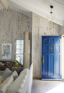
BEFORE & AFTER: The living room had great bones thanks to the cathedral ceiling, wood beams, stone fireplace, and pecky pine paneling. Whitewashing the walls and fireplace, as well as painting the ceiling timbers, brightened the dark mood. The portrait on the mantel is from Lesley’s childhood home. “I don’t know who it is, but I call him Grover,” she says. The table ajacent to the fireplace is a cherished possession. “It’s 8 feet long, but I have found a spot for it every place I have lived,” Lesley says. A sectional sofa from Birmingham Wholesale faces the mantel and makes the grand space welcoming. “Big rooms with high ceilings are often not very inviting, but this room feels cozy enough for one person yet big enough for large gatherings,” says Lesley, noting her penchant for hosting Girls Night Out and an annual Oscars party. Photos by Jean Allsopp
It is so much fun to transform an ugly duckling into an updated swan,” Lesley McRae says of the 1976 Mountain Brook townhome she renovated that, admittedly, had great bones but outdated feathers—some in questionable condition. “Where others might be put off by all the dreadfulness, I was chomping at the bit to remove rotted windowsills, groovy mirrored walls and wallpaper, acoustical tile ceilings, dirty carpet, and fluorescent light fixtures in order to bring my vision to life.” Lesley’s design perspective is unique—honed with a degree in architecture at Princeton followed by two years of studying fashion at Parsons. “I combined my architecture and fashion backgrounds to become an interior designer,” she says.
For this project, a 1,950-square-foot townhome, it was personal. Following the death of her husband and getting her youngest child off to college, Lesley was feeling the need to create a space for herself. “I was coming off of a hard time in my life and I wanted serenity,” she says. “I wanted this to be a place of healing, peace, and tranquility. Not too jarring. Not a lot of pattern.”
Lesley’s inspiration was the idea that the townhome, surrounded by mature trees, felt a bit like a mountain lodge. She replaced sliding-glass doors connecting the living room and deck with custom steel-and-glass doors and windows that stretch to the roofline. “This was my favorite but most difficult transformation,” Lesley says. “The first guy got in over his head and abandoned the job. I lived with a blue tarp curtain for several months until I could find someone to take on the half-completed project.”
Walls that once divided the kitchen from the dining and living space also came down. The kitchen received a to-the-studs makeover while other spaces only needed minimal changes. “I added wood floors to the kitchen and master bedroom and refinished parquet wood floors elsewhere,” Lesley says.
Shortly after the renovation, as fate would have it, Lesley fell in love, married, and moved to Tuscaloosa with her new husband. “I never fully got to enjoy living here, but life throws you unexpected curveballs,” Lesley says. “Staying grateful and looking ahead has always been my modus operandi. I hope people will not only find this space beautiful but will also feel inspired by my story. After all isn’t that why we do what we do?”
The blue hue of the front door appears in splashes around the house.In the master bedroom, a wine-tasting table and outdoor chairs create a sunny space for checking emails over morning coffee.BEFORE & AFTER: Lesley knocked down a wall to open the original kitchen to the dining room. A combination of semi-custom and readymade cabinets (uppers from cliqstudios.com; lowers from Cabinets To Go) balance the pricey GE Monogram glass-front refrigerator (Mazer Appliance). “I’m a big believer in high/low design to stretch the budget,” Lesley says. “The fridge was still expensive even though it was a floor model, but it really makes the space.” Home Depot tile and marble-look granite counters (Premier Surfaces) trimmed in walnut butcher block complete the space.BEFORE: The stairs had green carpet, and the wall was papered. “I liked the glue left behind after the wallpaper came down, so I didn’t paint—just left it,” Lesley says. “It looks like a faux finish.” AFTER: Lesley maximized floor space in the dining area by pushing the table against the wall rather than placing it in the center of the room. This area provides a workspace, as well as a place for entertaining. Lesley originally planned to have cabinets installed as pantry space at one end of the kitchen until she found a freestanding glass cabinet from At Home in Homewood that fit perfectly and added the character she desired.
Lesley McRae shares her tips for making a space your own (when a full remodel is out of the question).
Pick a palette.
“A fresh paint job brings new life to a space and doesn’t have to be expensive,” Lesley says. She suggests limiting your palette to two or three related colors. ”Then add a flash of color with accessories or by painting an accent wall or ceiling.”
Edit, edit, edit.
“Declutter, remove small tchotchkes, and gather photos or collections in one place rather than displaying on every surface,” Lesley says. “Leaving some tabletops and shelves open gives your space room to breathe.”
Undress windows. “Bare windows feel clean and modern,” says the designer. If you need privacy or light control, she suggests using simple Roman shades. “They require less fabric—and money—than drapery panels,” she says.
Add a statement light fixture. “Introduce modern lighting to update traditional spaces,” Lesley says. One of her favorite designs is the Noguchi paper lantern, a contemporary classic.
Limit pattern. If you use patterns, Lesley suggests limiting them to small furnishings, pillows, and accessories. That allowsyou to change out these items as you tire of them. “For impact, wallpaper just one wall,” she says. “New peel-and-stick papers make the treatment easy to undo, too.”
RESOURCES Designer:Lesley McRae Design, lesleymcrae.comBuilder/contractor and custom wood stain/pickling Rick Armstrong via Lesley McRae Design Living room: Steel-and-glass window wall: Jacob Rinker of Woodgrain Design, 662.801.7181 Purple ottoman: Patina, 205.802.9805 Mirror over green table: Henhouse Antiques, 205.918.0505 Banquette in kitchen: custom upholstery by Mark V Jordan, 334.220.1056 Painting over banquette: Tal Walton, bought in Santa Fe. Rug: Overstock.com
Rather than rip off the old metal awnings, which would have necessitated new siding, Zoë painted them with a cheerful two-tone stripe in Sassy Green and Creamy from Sherwin-Williams. Photos by Laurey Glenn
I found your house.” That’s what Zoë Gowen’s friend and soon-to-be neighbor said when she called to tell her about a little cottage she’d spotted on a sought-after street in Homewood. Upon seeing the home, Zoë promptly agreed. “It had the intangibles—great neighborhood, wonderful natural light, and lovely proportions,” she says. What the 800-square-foot house didn’t have, however, was character of any sort. From the shabby brown exterior to the drab rooms (all six of them!) and the falling-down back deck and shed, it was depraved of charm. But Zoë Gowen, a veteran homes and gardens magazine editor, saw potential where others saw problems. “I had been writing about renovations and small homes for years, so I was ready to see if I could make it work in my own home,” she says. “The house had been on the market for 250 days. I was the one ready to finally tackle it!”
And tackle it she did. The gung ho first-time homeowner left no surface untouched as she took the cottage from eyesore to eye-pleasing. The first order of business was twirling up the exterior. “I knew that the house was small enough that I could basically do every cutesy cottage thing,” Zoë says. She started by adding a Dutch door and window boxes, as well as giving the exterior a cheerful new green-and-white color scheme.
Inside, painting was the top priority. The formerly beige walls were coated in White Dove by Benjamin Moore. Zoë also put the floors in neutral, so to speak, opting to paint them Shaded White from Farrow & Ball instead of refinishing them with a stain. The economical choice was also a matter of small-space style. “It just made everything feel so open and cohesive,” she says.
With her penchant for exuberant colors and patterns, not to mention a soft spot for estate sales, Zoë then layered in bright textiles, bold artwork, and a hodgepodge of vintage finds to create sophisticated rooms that belie the home’s small footprint.
Once the house was in tip-top shape, Zoë turned her attention to the deck and shed that were both begging for some TLC. She worked with friend and architect Ebee Tullos to replace the rotting decking with a dreamy new screened porch that enhances the home’s available living space and also cleverly conceals a much-needed laundry nook. As for the shed? It became the novice renovator’s masterpiece project. Zoë reimagined the ramshackle outbuilding into a serene studio with the help of a new HVAC, paneled walls, slate flooring, and (surprise!) buckets and buckets of white paint.
From the front door to the back porch, the house now brims with verve and hospitality—just like the spunky magazine editor who calls it home.
BEFORE: Wainscoting made the dining room feel choppy instead of charming. With adjoining rooms on three sides, the space was also starved for natural light. AFTER: Peach strié walls (Summer Melon from Benjamin Moore with a gold glaze) give the center of the house visual presence. A skirted dining table adds a sense of formality to the space. Beyond, new French doors replace the original window to draw the eye outward to the new screened porch. Zoë saved money by sanding the hardwoods herself and then painting them Shaded White from Farrow & Ball. She also upcycled a ho-hum basket into a light fixture with the help of white spray paint and a hanging bulb kit.Zoë’s collection of furniture and accessories consists of fine antiques, estate-sale finds, and closeout bargains, as well as magazine prop-sale items. A rug from Paige Albright helps unite the fresh pink, orange, blue, and green color palette. Zoë held on to a swatch of peony pink fabric for more than five years before finally splurging on her Lee Industries sofa in that color. “I wanted a deep sofa I could basically live on,” she says. “I saved up until I could afford the fabric and a sofa with the plush down filling I wanted.”A china cabinet holds an array of table matters, including silver, McCartys pottery, and export china from Tom Fortner Antiques in Memphis, Zoë’s hometown.“I knew my first house wouldn’t be my forever home. With that in mind, I decided to invest in items I could take with me and get scrappy with elements that would have to stay.” — ZOË GOWENZoë spiffed up the porch with upholstered furniture, draperies, and lamps. The latter were revamped with spray paint like the turquoise one shown above. Another thrifty DIY: upcycling a vintage curtain panel into pretty floral throw pillows.
Space Savers
1.Paint It White. A neutral-palette backdrop of white walls and floors is a foolproof way to create a larger, more open feel.
2.Opt for Full-Size Furniture. Small spaces do not call for equally tiny furnishings. A few generously proportioned items will keep a room from feeling bitsy in scale.
3.Skirt the Situation. Fabric-covered pieces, such as Zoë’s dining table and washer and dryer, introduce feminine flair and conceal extra storage.
4.Make Way for Mirrors. Large mirrors amplify natural light. They are an easy way to give even the tiniest room a new, airy lease on life.
5.Embrace Outdoor Spaces. Zoë nearly doubled the cottage’s available living space with a new screened porch and shed renovation.
BEFORE & AFTER: A dilapidated shed found new life as Zoë’s design studio. As a sometime decorator (in addition to her full-time magazine career), Zoë uses the space to scheme new designs for her clients. It also doubles as a very charming second dining room. A unique light fixture from Serena & Lily hangs above a custom table and chairs. The Roman shade was made from two tablecloths (marigoldliving.com). Bench fabric is from Hobby Lobby.
Meet ZOË GOWEN
As the former senior home and garden editor for Southern Livingmagazine, and now executive editor for Atlanta Homes & Lifestyles, Zoë knows the ins and outs of combining high design and bargain finds.
Personal Style ”I’d describe it as old-lady chic with a big twist of straightforward practicality,” says Zoë.
Design Inspiration ”I’ve been subconsciously re-creating my favorite spot in my childhood home since I left it at age 18,” Zoë says. “It’s a shrimp-colored living room with a big chintz sofa where I read all of my books.”
Best Zero-Dollar Find“The sunny yellow lamp on my screened porch,” says Zoë. “I found sitting it on a curb while on a walk.”
RESOURCES Interiors: Zoë Gowen Porch addition architecture:Ebee Tullos, 404.931.6889 Styling, plants, floral arrangements, containers: Mark Thompson of Shoppe Birmingham, shoppebham.com, 205.224.4450 Front exterior: Dutch door Jeld-Wen, jeld-wen.com Hardware: Brandino Brass, brandinobrass.com Living room Painting: Hanna Antiques, hannaantiques.com Framed photos: iPhone travel photos blown up via whitewall.com Chest: antique from auction, refinished by Charles Wade, 205. 251.9233 Mirror and pressed-botanical print: Shoppe Birmingham Dining Room table skirt: Citrus Garden in Primary, Schumacher, fschumacher.com Pillows: World Market, worldmarket.com Art: Birmingham Vintage Company through Hanna Antiques Chairs: vintage, Chelsea Antiques, chelseaantiques1.com Screened porch: Sofa and table: chairish.comChairs: Ikea, ikea.com Outdoor cushion fabric: fabricguru.com Mirror over bar: World Market


 HIRE A PROFESSIONAL


 Ashley Gilbreath finding balance


 BE PREPARED


 HIRE AN ARCHITECT




 Lesley McRae


 Space Savers

 Meet